Chapter 6
Creating Depth
Emulate a light source
Have you ever noticed how some elements in an interface feel like they’re raised off of the page, while others feel like they are inset into the background?
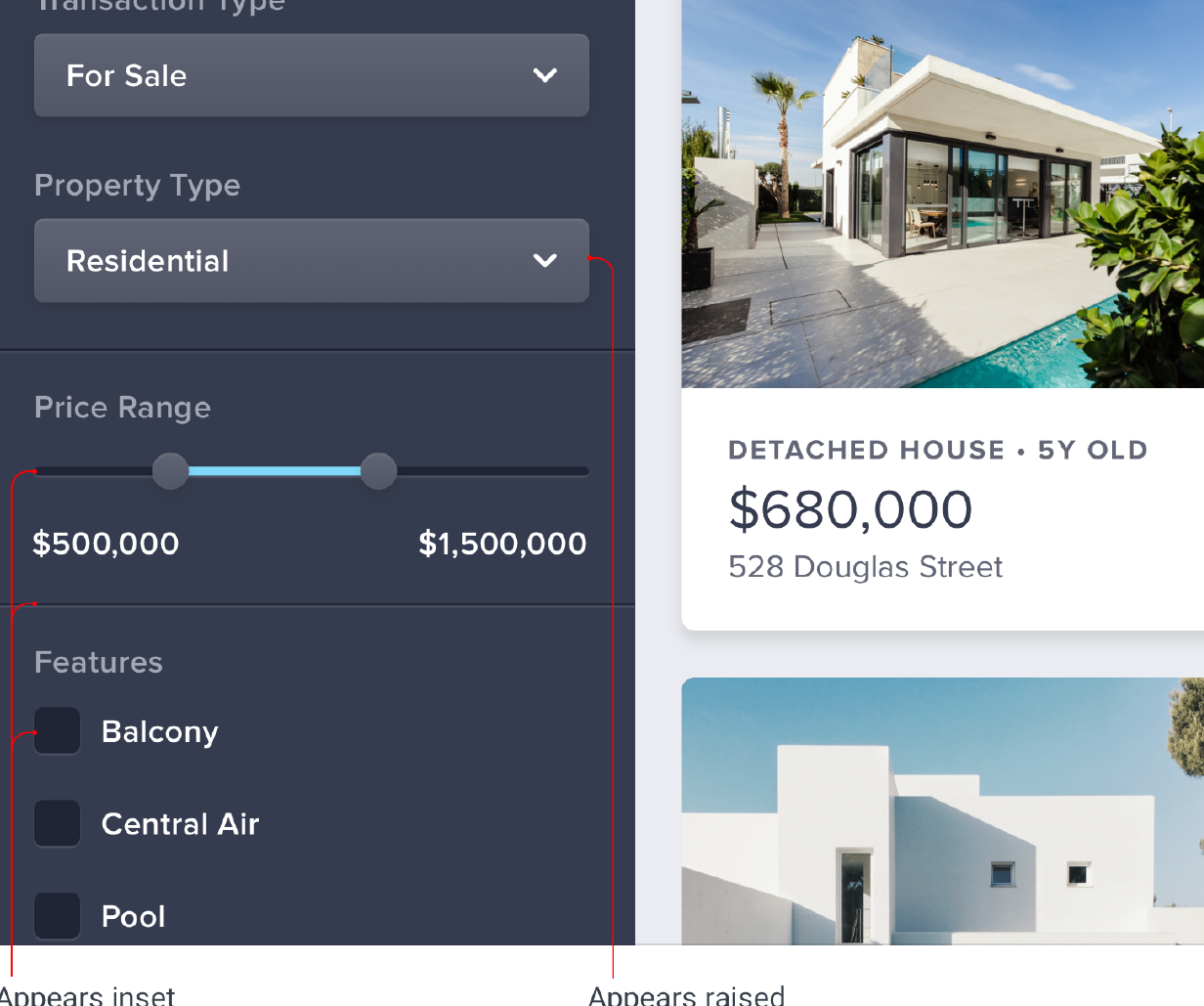
Creating this effect might look complicated at first, but it actually only requires you to understand one fundamental rule.
Light comes from above
Take a look at the panelling on this door:
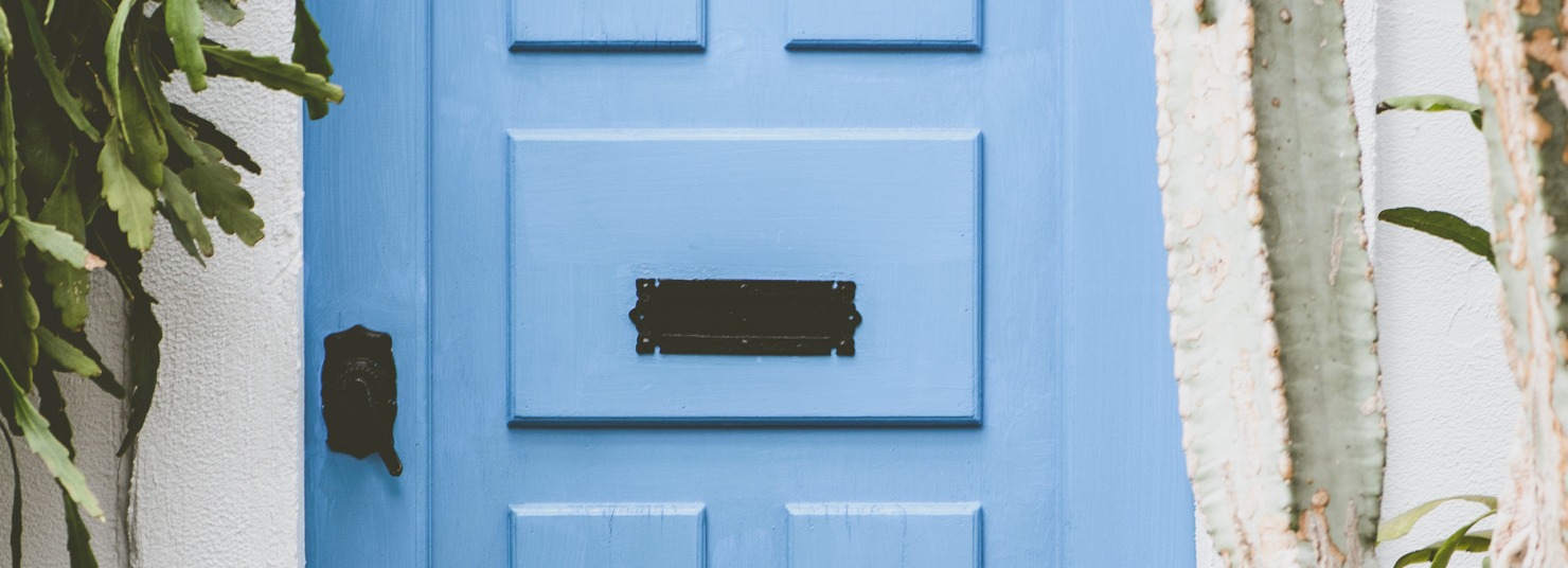
Even though you’re just looking at a flat image, it’s still pretty obvious that the panels on the door are raised. Why is that?
Notice how the top edge of the panel is lighter? That’s because it’s angled towards the sky and receives more light. Similarly, the bottom edge is darker because it’s angled away from the sky, receiving less light.
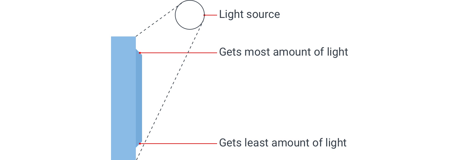
The only way those edges could possibly be oriented that way is if the panel itself is raised, so that’s how our brains perceive it.
Now take a look at the panelling on this cabinet:
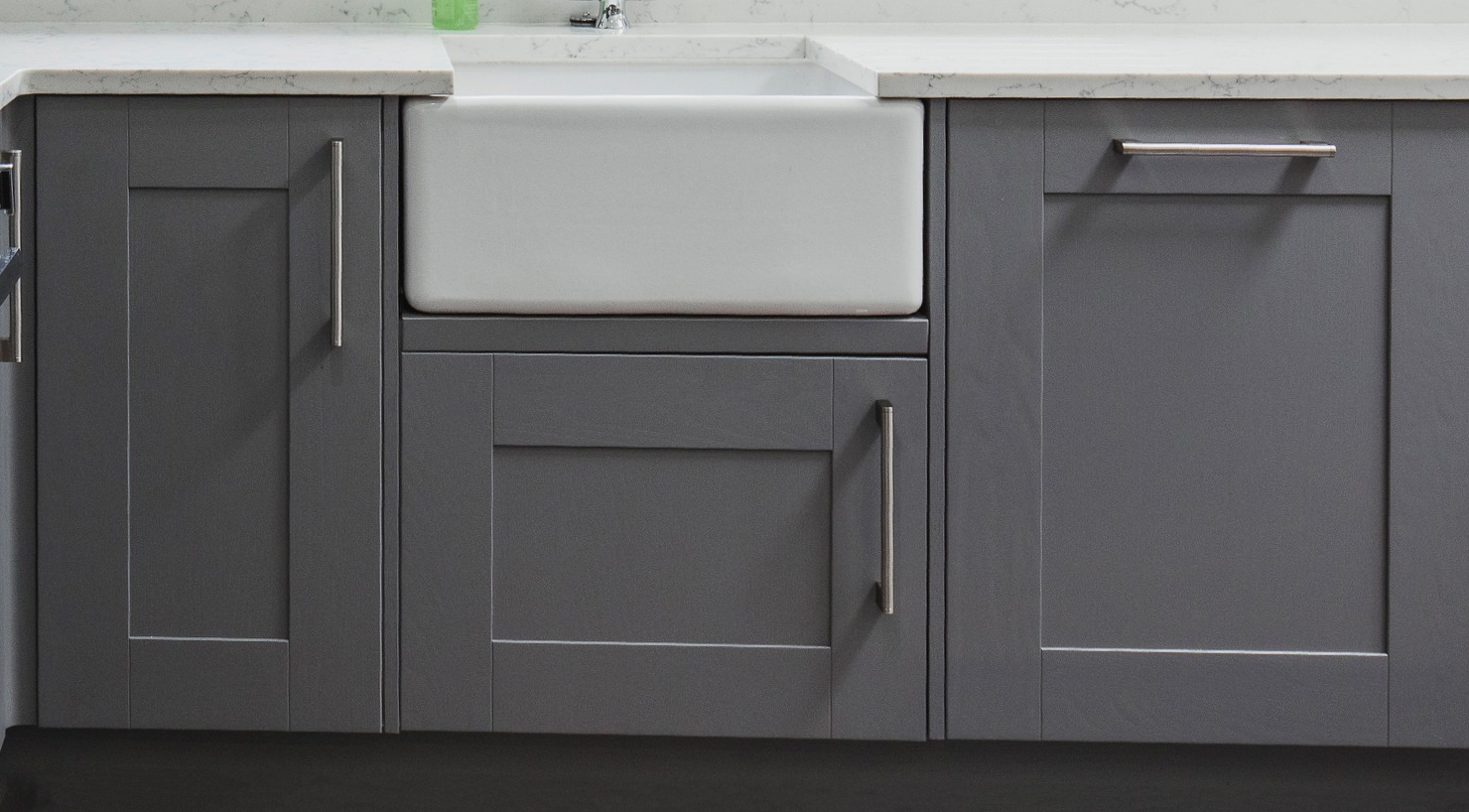
In this case it’s clear that the panels are inset because there’s a shadow at the top indicating that the lip above is blocking the light, and the bottom edge is lighter, indicating that it’s angled upward.
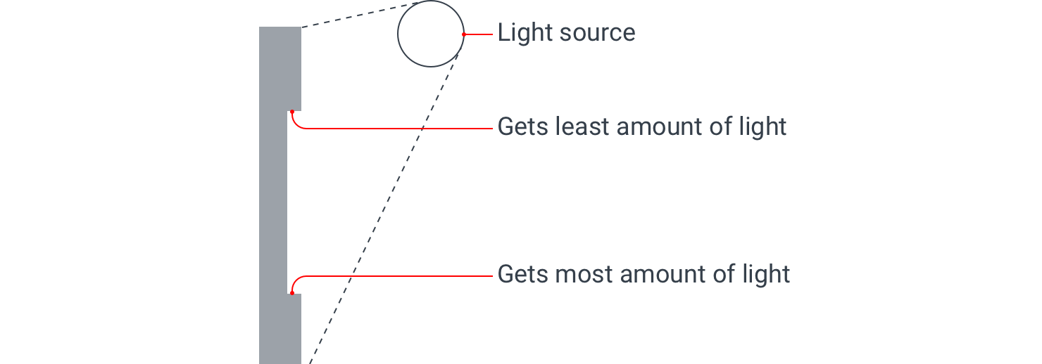
To create this same sense of depth in your designs, all you need to do is mimic the way light affects things in the real world.
Simulating light in a user interface
If you want an element to appear raised or inset, first figure out what profile you want that element to have, then mimic how a light source would interact with that shape.
Raised elements
For example, say you had a button and you wanted it to feel raised off of the page, with perfectly flat edges on the top and bottom:
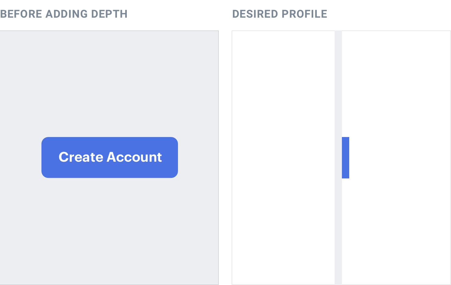
Because the top and bottom edges are both flat, it would be impossible to see both of them at the same time. People generally look slightly downward towards their screens, so for the most natural look, reveal a little bit of the top edge and hide the bottom edge.
Since the top edge is facing upward, make it slightly lighter than the face of
the button, usually using a top border or an inset box shadow with a slight vertical offset:
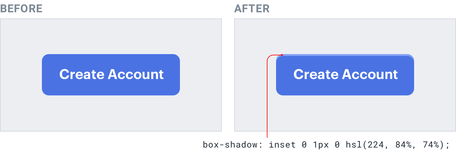
Choose the lighter color by hand instead of using a semi-transparent white for best results — simply overlaying white can suck the saturation out of the underlying color.
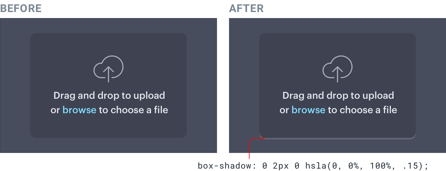
Next, you need to account for the fact that a raised element will block some of the light from reaching the area below the element.
Do this by adding a small dark box shadow with a slight vertical offset (you only want the shadow to appear below the element):
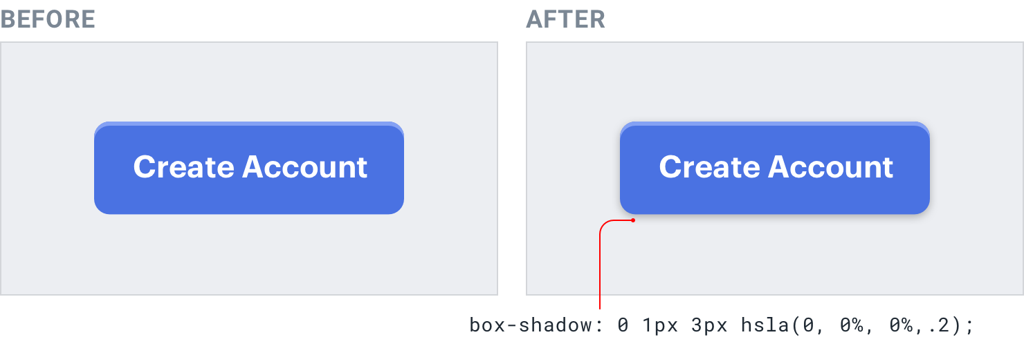
Don’t get carried away with the blur radius, a couple of pixels is plenty. These
sorts of shadows should have pretty sharp edges — take a look at the shadow cast by the bottom of a wall outlet or window frame for a real-world example.
Inset elements
Say you’re designing a “well” component that should feel like it’s recessed into the page.
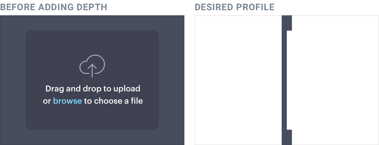
Looking slightly downward, only the bottom lip would be visible. Since it’s facing towards the sky, give that edge a slightly lighter color using a bottom border or inset shadow with a negative vertical offset:
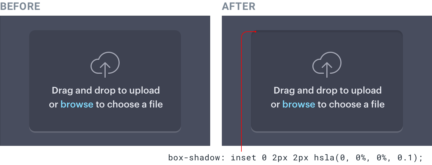
The area above the well should block some of the light from reaching the very top of the well, so add a small dark inset box shadow with a slight positive vertical offset to make sure it doesn’t poke through at the bottom:
This same treatment works for any element that may need to appear inset, for example text inputs and checkboxes:

Don’t get carried away
Once you understand how to simulate light in an interface, it can be tempting to tinker away for hours, tweaking and tweaking to see how closely you can mimic the real world.
While this can be a fun exercise, in practice it can lead to interfaces that are busy and unclear. Borrowing some visual cues from the real world is a great way to add a bit of depth, but there’s no need to try and make things look photo-realistic.
Use shadows to convey elevation
Shadows can be more than just a flashy effect — used thoughtfully, they let you position elements on a virtual z-axis to create a meaningful sense of depth.
Small shadows with a tight blur radius make an element feel only slightly raised off of the background, while larger shadows with a higher blur radius make an element feel much closer to the user:
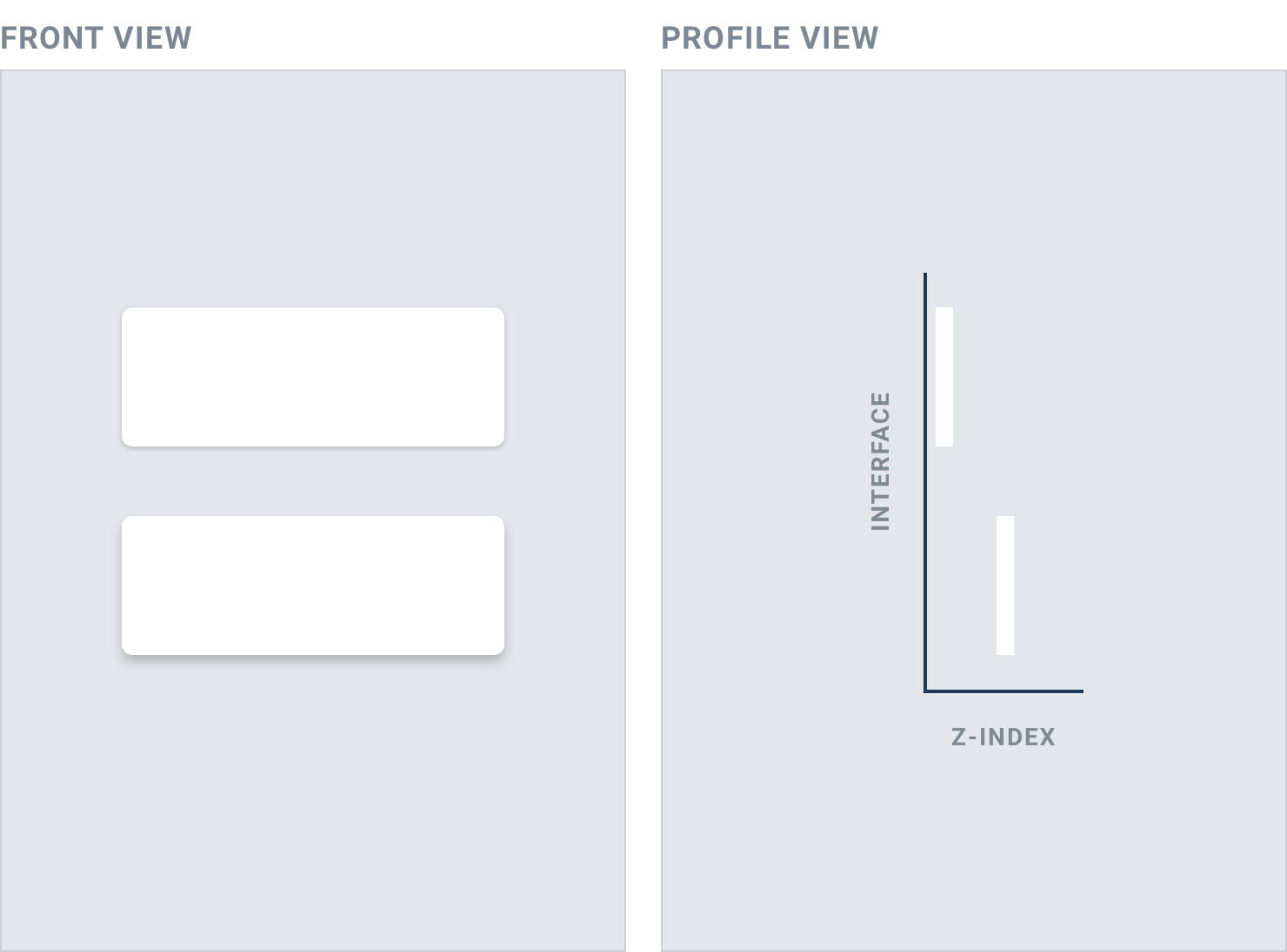
The closer something feels to the user, the more it will attract their focus.
You might use a smaller shadow for something like a button, where you want the user to notice it but don’t want it to dominate the page:
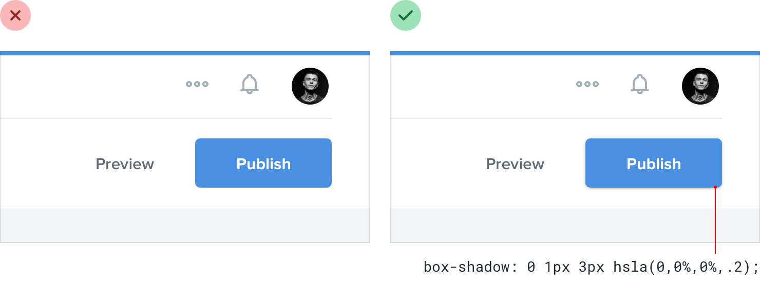
Medium shadows are useful for things like dropdowns; elements that need to sit a bit further above the rest of the UI:
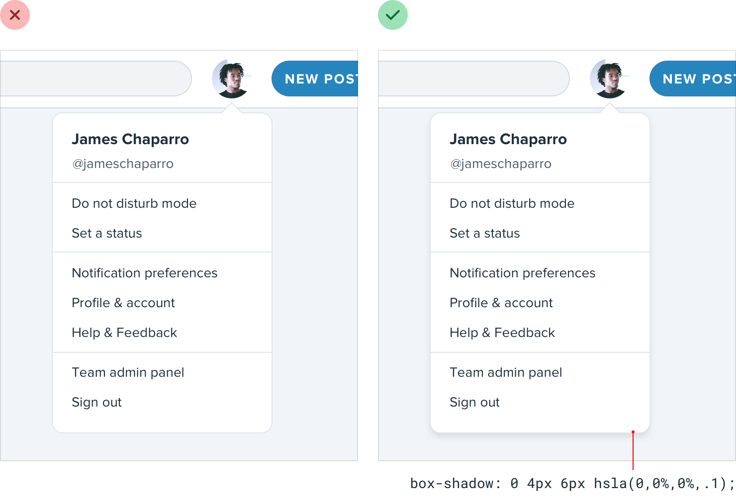
Large shadows are great for modal dialogs, where you really want to capture the user’s attention:
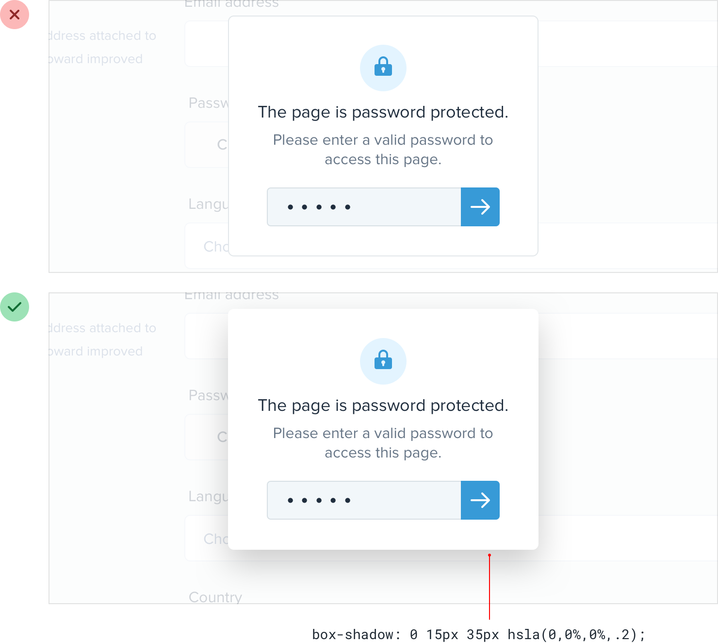
Establishing an elevation system
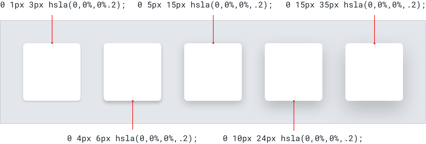
Just like with color, typography, spacing, and sizing, defining a fixed set of shadows will speed up your workflow and help maintain consistency in your designs.
You don’t need a ton of different shadows — five options is usually plenty.
Start by defining your smallest shadow and your largest shadow, then fill in the middle with shadows that increase in size pretty linearly:
Combining shadows with interaction
Shadows aren’t only useful for positioning elements on the z-axis statically; they’re a great way to provide visual cues to the user as they interact with elements, too.
For example, say you had a list of items where the user could click and drag each item to sort them. Adding a shadow to an item when a user clicks it makes it feel like it pops forward above the other items in the list, and makes it clear to the user that they can drag it:
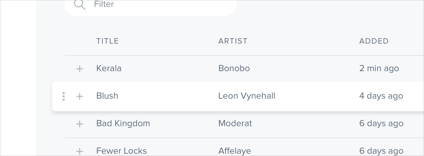
Similarly, you can make a button feel like it’s being pressed into the page when a user clicks it by switching to a smaller shadow, or perhaps removing the shadow altogether:
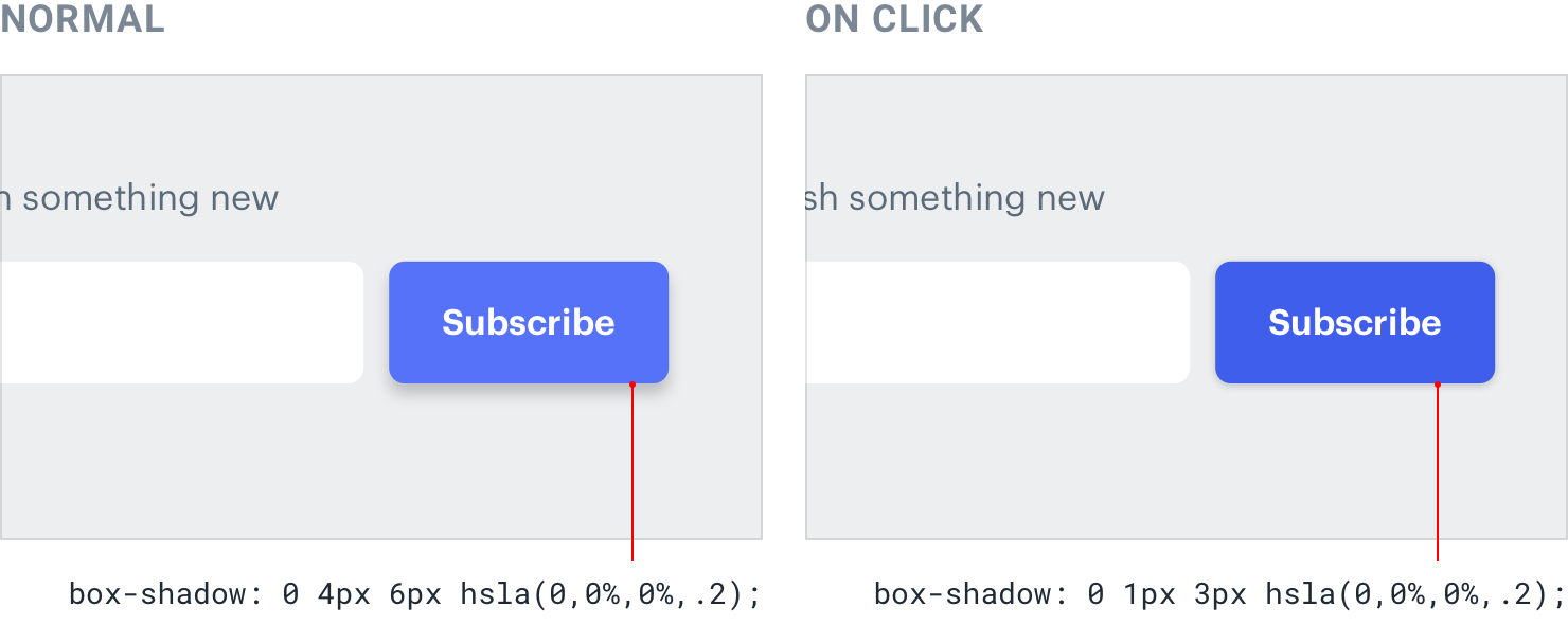
Using shadows in a meaningful way like this is a great way to hack the process of choosing what sort of shadow an element should have. Don’t think about the shadow itself, think about where you want the element to sit on the z-axis and assign it a shadow accordingly.
Shadows can have two parts
Ever inspected a really nice shadow on a site and noticed they were actually using two shadows?
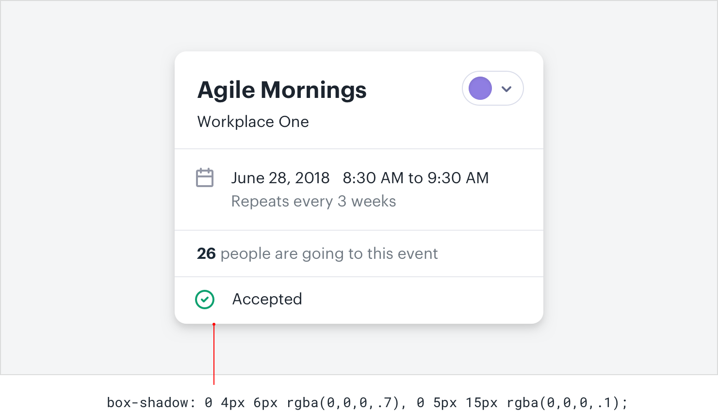
There’s a method to this madness, and it’s actually pretty simple and makes a lot of sense.
When you see someone combining two shadows, they’re not just experimenting randomly until things look nice, they’re using each shadow to do a specific job.
The first shadow is larger and softer, with a considerable vertical offset and large blur radius. It simulates the shadow cast behind an object by a direct light source.
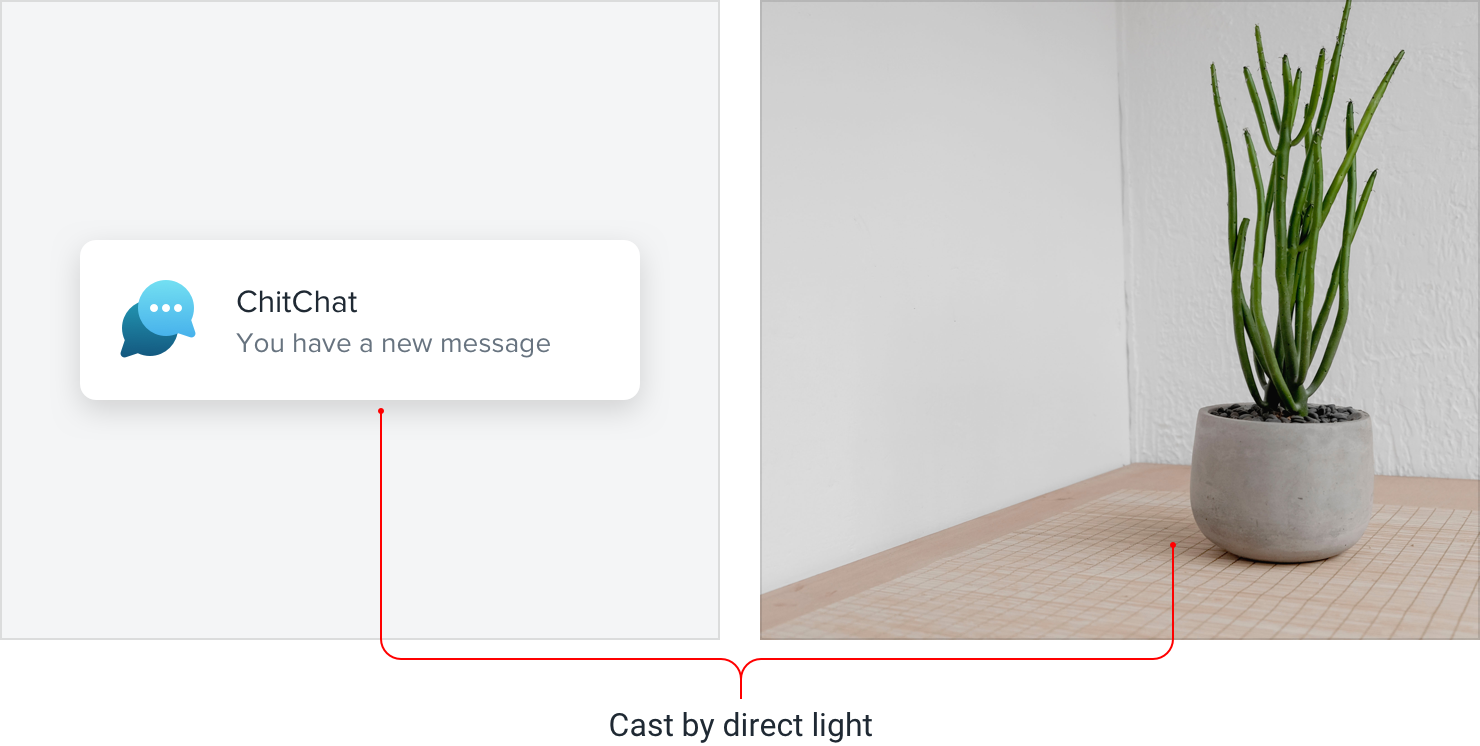
The second shadow is tighter and darker, with less of a vertical offset and a smaller blur radius. It simulates the shadowed area underneath an object where even ambient light has a hard time reaching.
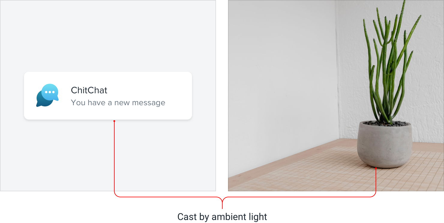
Using two shadows like this gives you a lot more control than you’d get with a single shadow — you can keep the larger shadow nice and subtle while still
making the shadow closer the element’s edges nice and defined.

Accounting for elevation
As an object gets further away from a surface, the small, dark shadow created by a lack of ambient light slowly disappears (go ahead, try it out with something on your desk).
So if you’re going to use this two-shadow technique in your own projects, make sure you make that shadow more subtle for shadows that represent a higher elevation.
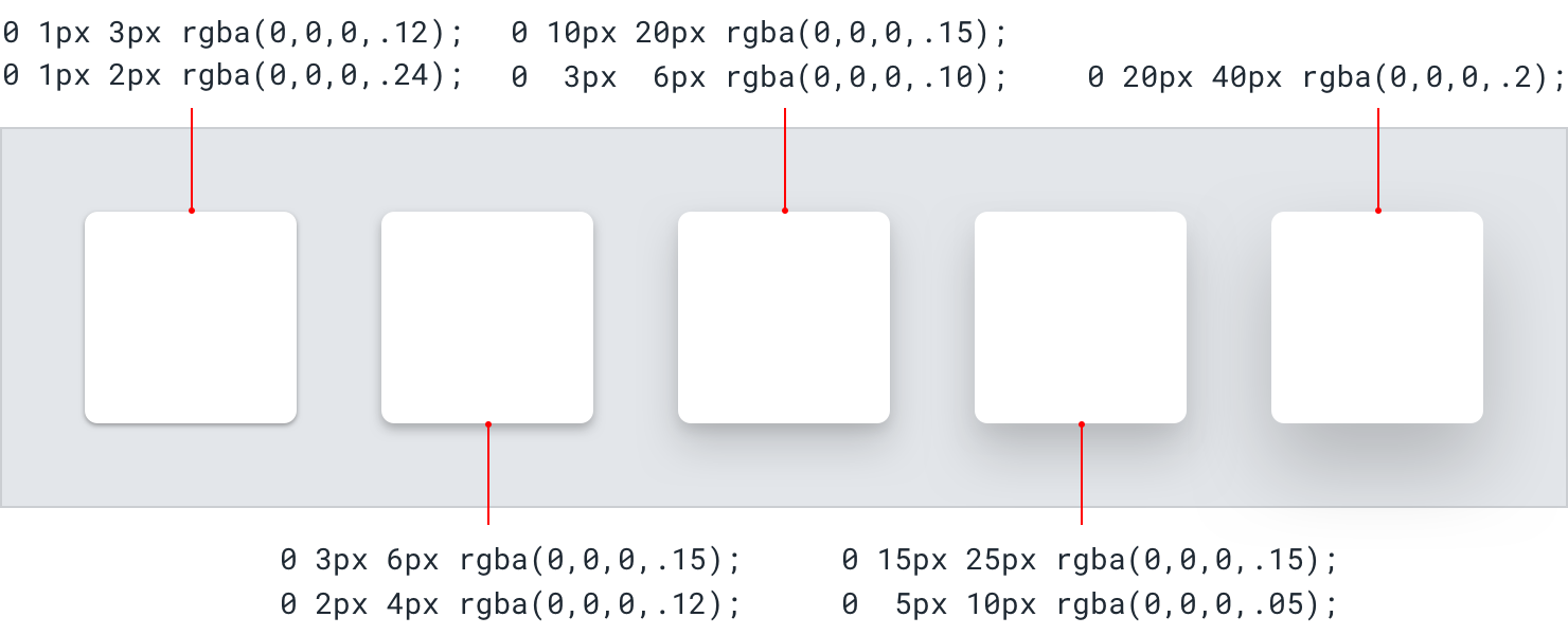
It should be quite distinct for your lowest elevation, and almost (or completely) invisible at your highest elevation.
Even flat designs can have depth
When most people talk about “flat design”, they mean designing without shadows, gradients, or any other effects that try to mimic how light interacts with things in the real-world.
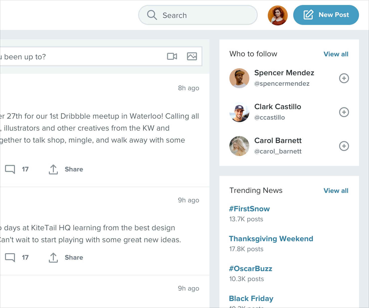
But the most effective flat designs still convey depth, they just do it in a different way.
Creating depth with color
In general (especially with shades of the same color), lighter objects feel closer to us and darker objects feel further away.
Make an element lighter than the background color to make it feel like it’s raised off of the page, or darker than the background color if you want it to feel inset like a well:
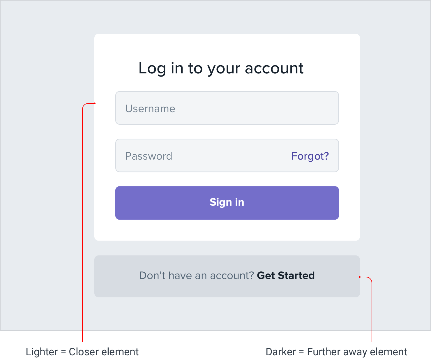
This is just as applicable to non-flat designs, too — color is just another tool in your toolbelt for conveying distance.
Using solid shadows
Another way to communicate depth in a flat design is to use short, vertically offset shadows with no blur radius at all.
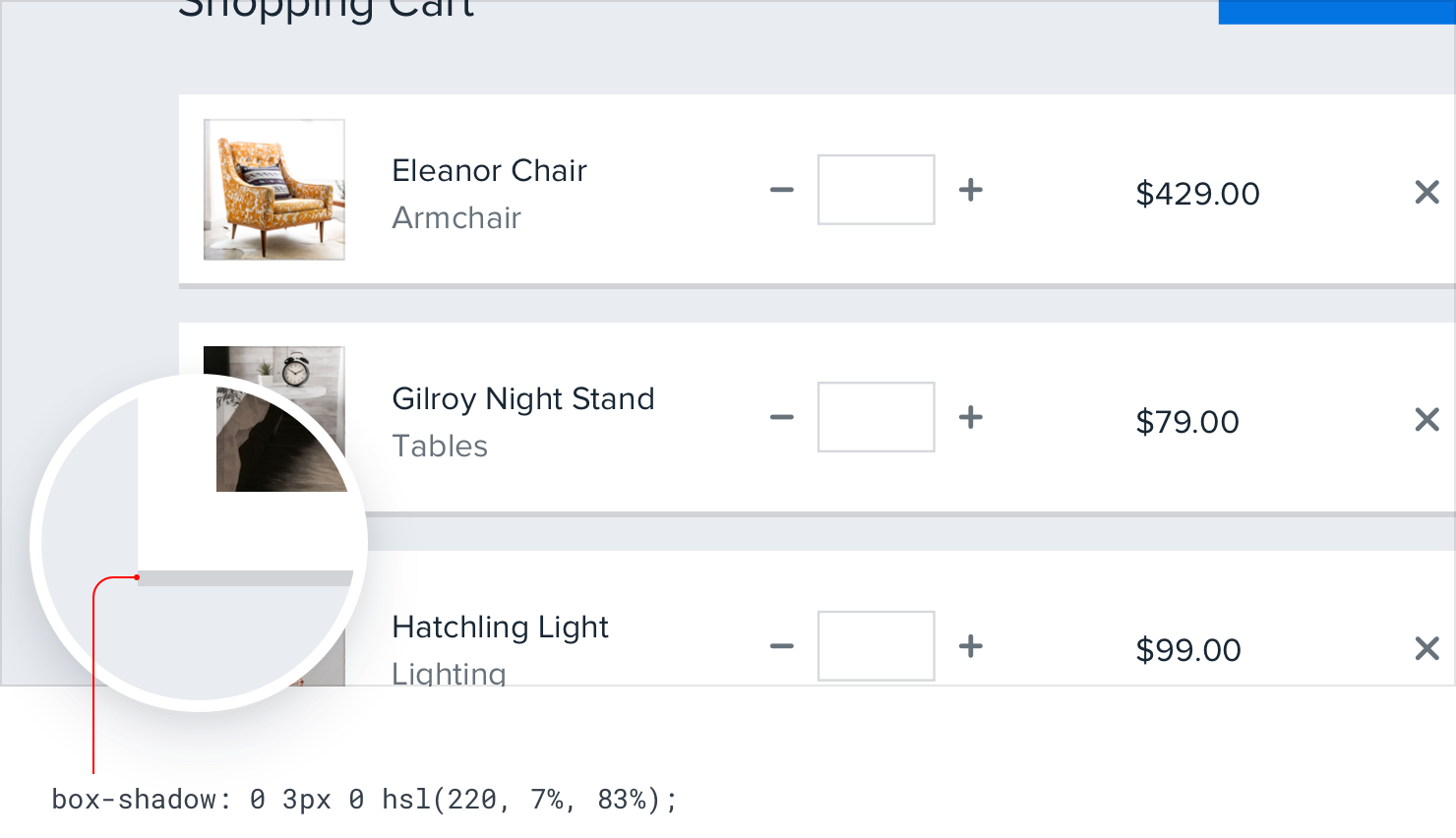
It’s a great way to make a card or button stand off the page a little bit without sacrificing that flat aesthetic.
Overlap elements to create layers
One of the most effective ways to create depth is to overlap different elements to make it feel like a design has multiple layers.
For example, instead of containing a card entirely within another element, offset it so it crosses the transition between two different backgrounds:

You could also make an element taller than its parent, so it overlaps on both sides:

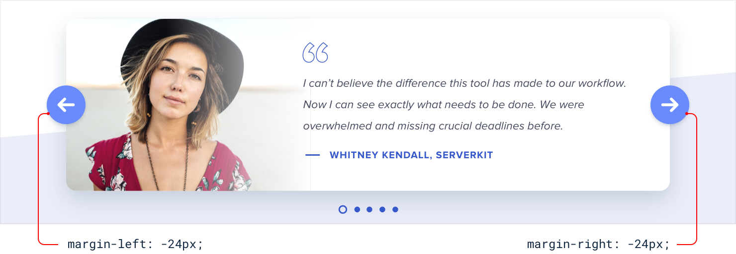
Overlapping elements can add depth to smaller components too, for example the controls on this carousel:
Overlapping images
This technique can work great with images as well, but without special
consideration it’s easy for overlapping images to clash.

A simple trick for avoiding this is to give the images an “invisible border” — one that matches the background color — so there’s always a bit of a gap between images:
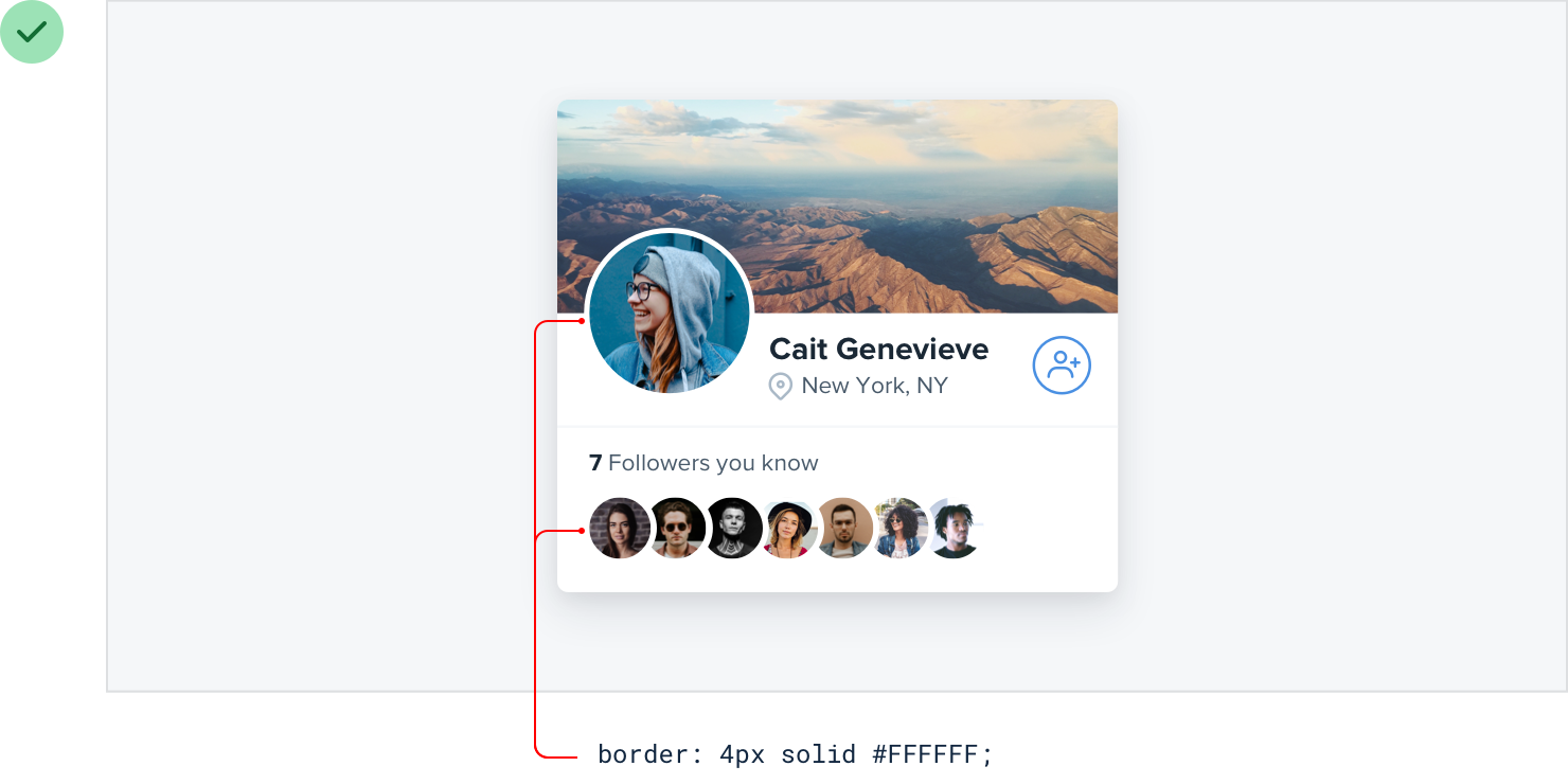
You’ll still create the appearance of layers but with none of the ugly clashing.