Chapter 8
Finishing Touches
Supercharge the defaults
You don’t always have to add new elements to a design to add flare — there are a lot of ways to liven up a page by “supercharging” what’s already there.
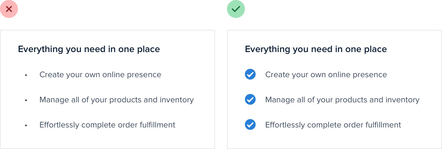
For example, if your design includes a bulleted list, try replacing the bullets with icons:
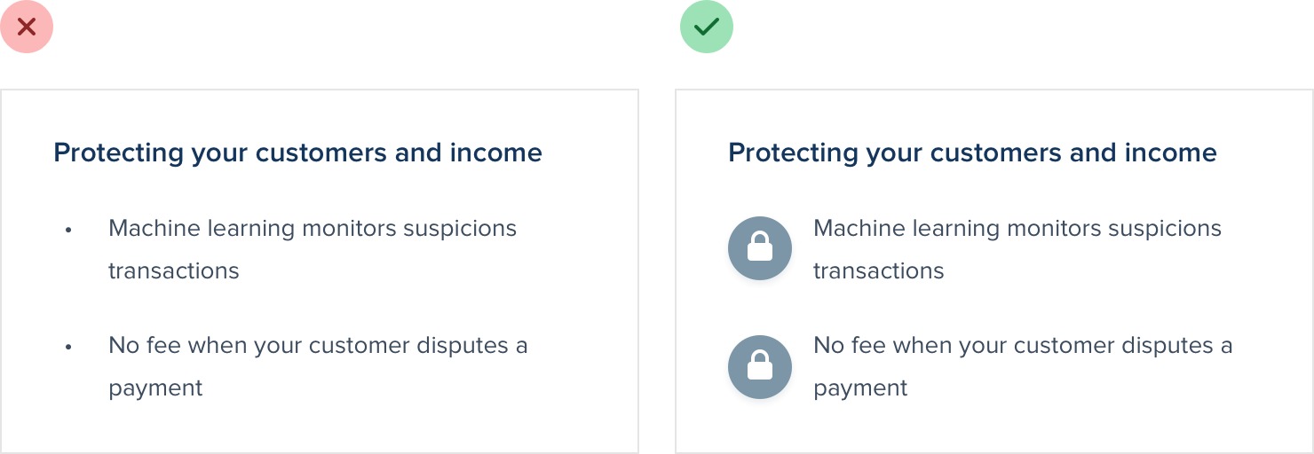
Checkmarks and arrows are great generic choices for a lot of situations, but you can also use something more specific to your content, like a padlock icon for a list of security-related features:
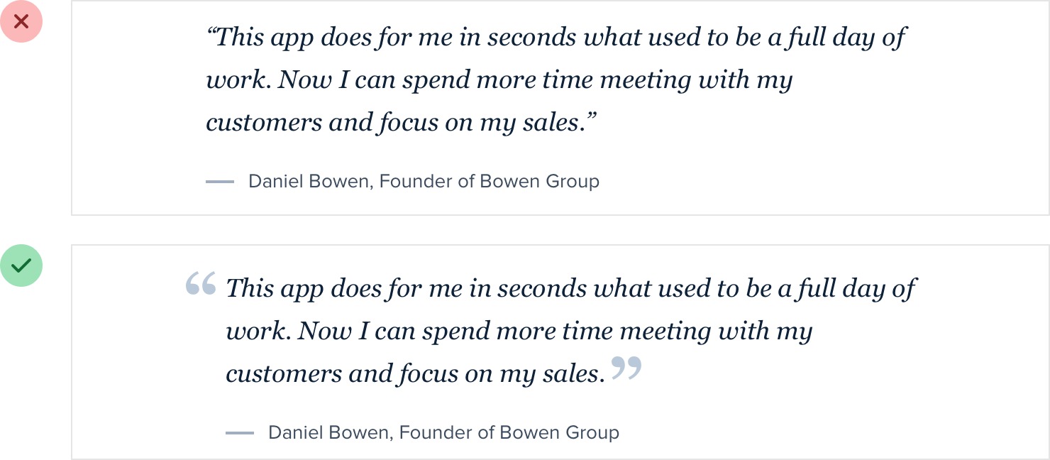
Similarly, if you’re working on a testimonial try “promoting” the quotes into visual elements by increasing the size and changing the color:
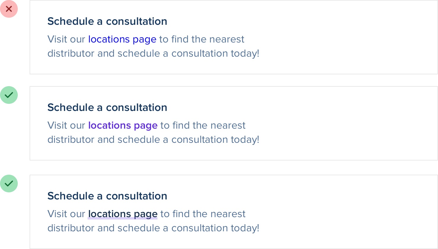
Links are another great candidate for special styling. You can do something as simple as changing the color and font weight, or something as fancy as a thick and colorful custom underline that partially overlaps the text:
If you’re working on a form, using custom checkboxes and radio buttons is an easy way to add some color to the design:
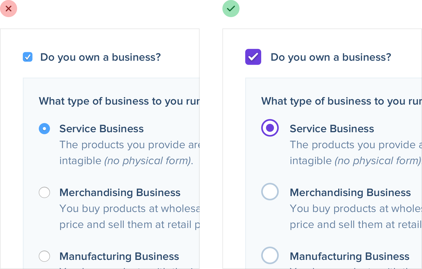
Just using one of your brand colors for the selected states instead of the browser defaults is often enough to take something from feeling boring to feeling polished and well-designed.
Add color with accent borders
If you’re not a graphic designer, how do you add that dash of visual flair to your UI that other designs get from beautiful photography or colorful illustrations?
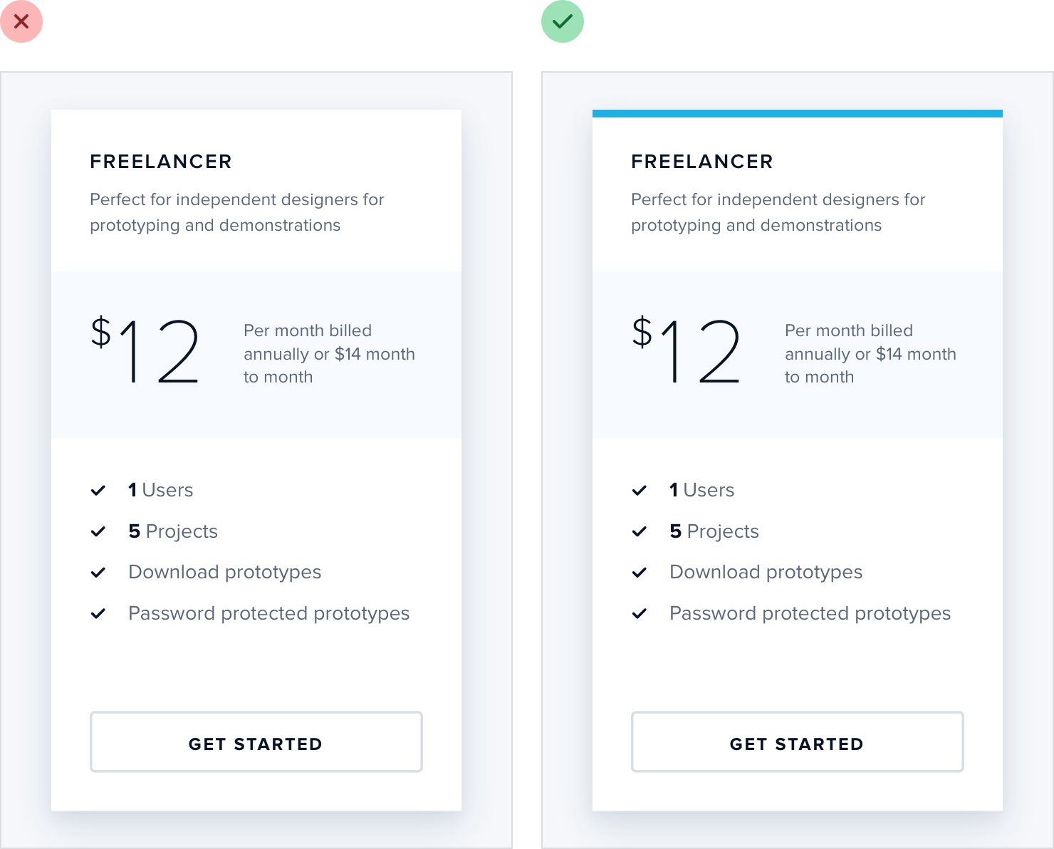
One simple trick that can make a big difference is to add colorful accent borders to parts of your interface that would otherwise feel a bit bland.
For example, across the top of a card:
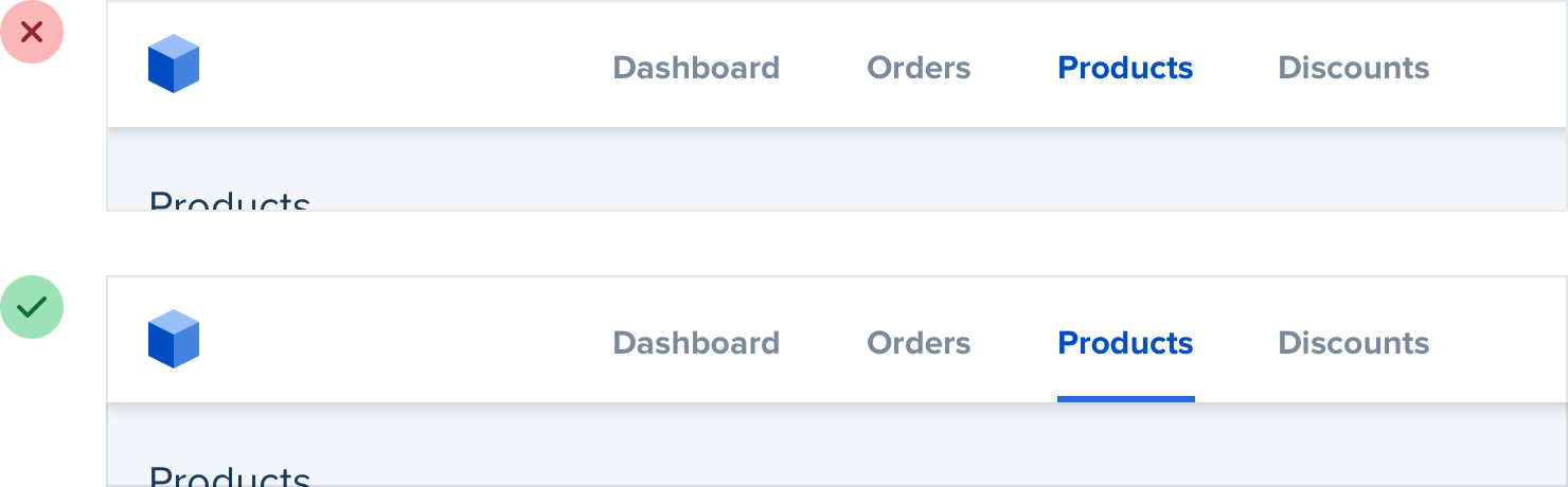
…or to highlight active navigation items:
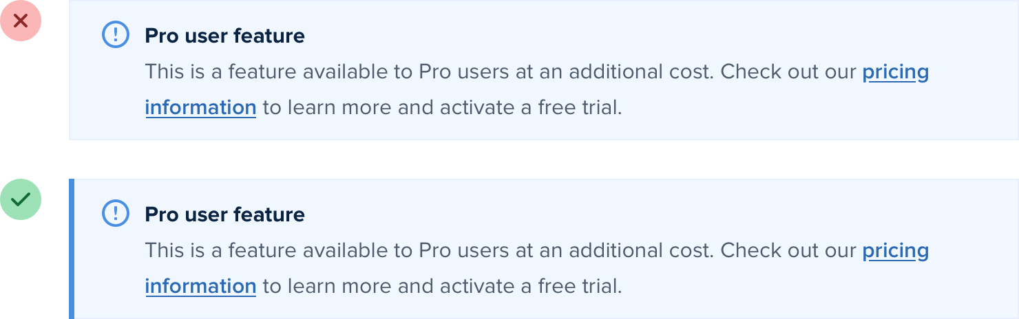
…or along the side of an alert message:
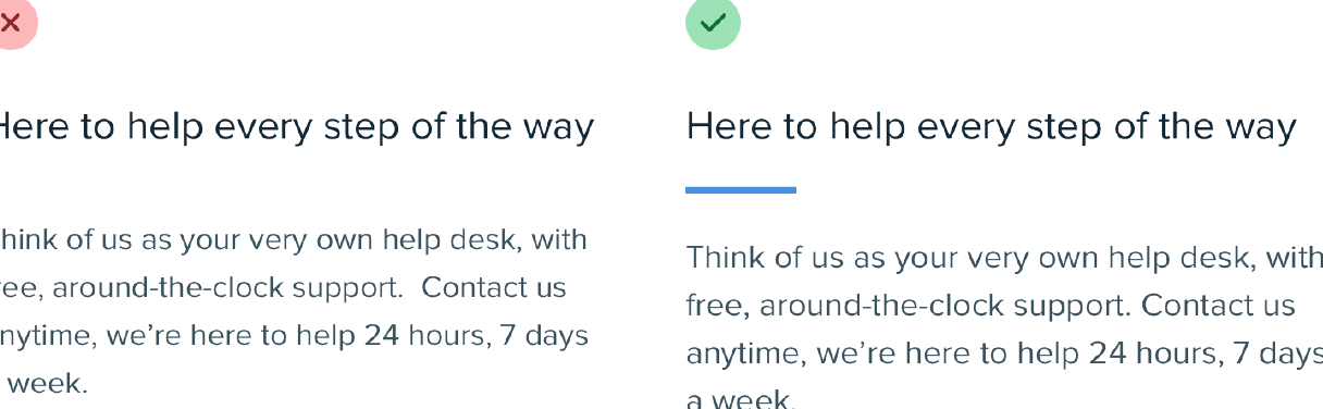
…or as a short accent underneath a headline:
…or even across the top of your entire layout:
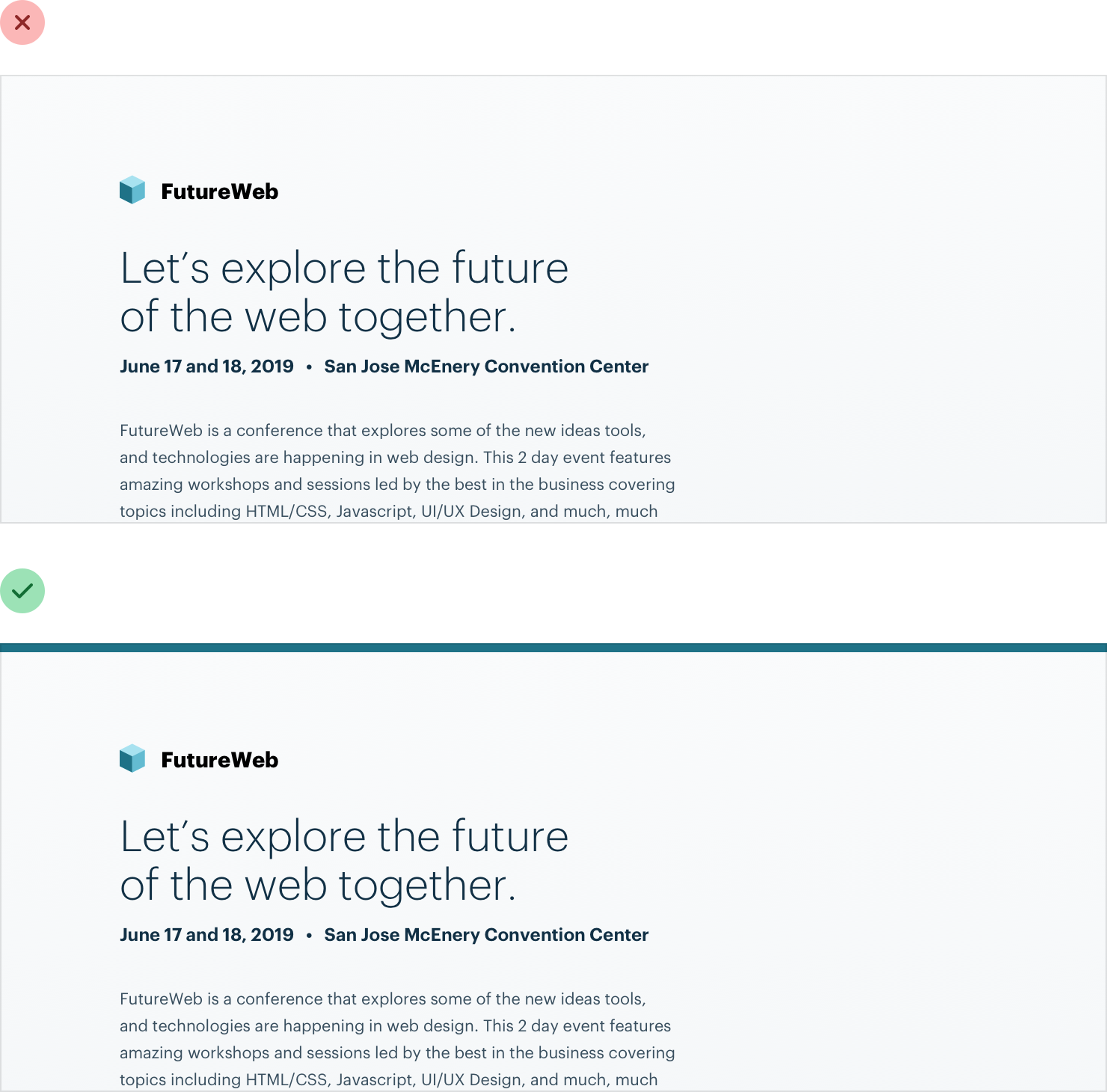
It doesn’t take any graphic design talent to add a colored rectangle to your UI, and it can go a long way towards making something feel more “designed.”
Decorate your backgrounds
Even if you do a great job with hierarchy, spacing, and typography, sometimes a design will still feel a little bit plain.
A great way to break up some of the monotony without drastically altering the design is to add some excitement to a few of your backgrounds.
Change the background color
One way to add some excitement to a background is to simply change the color.
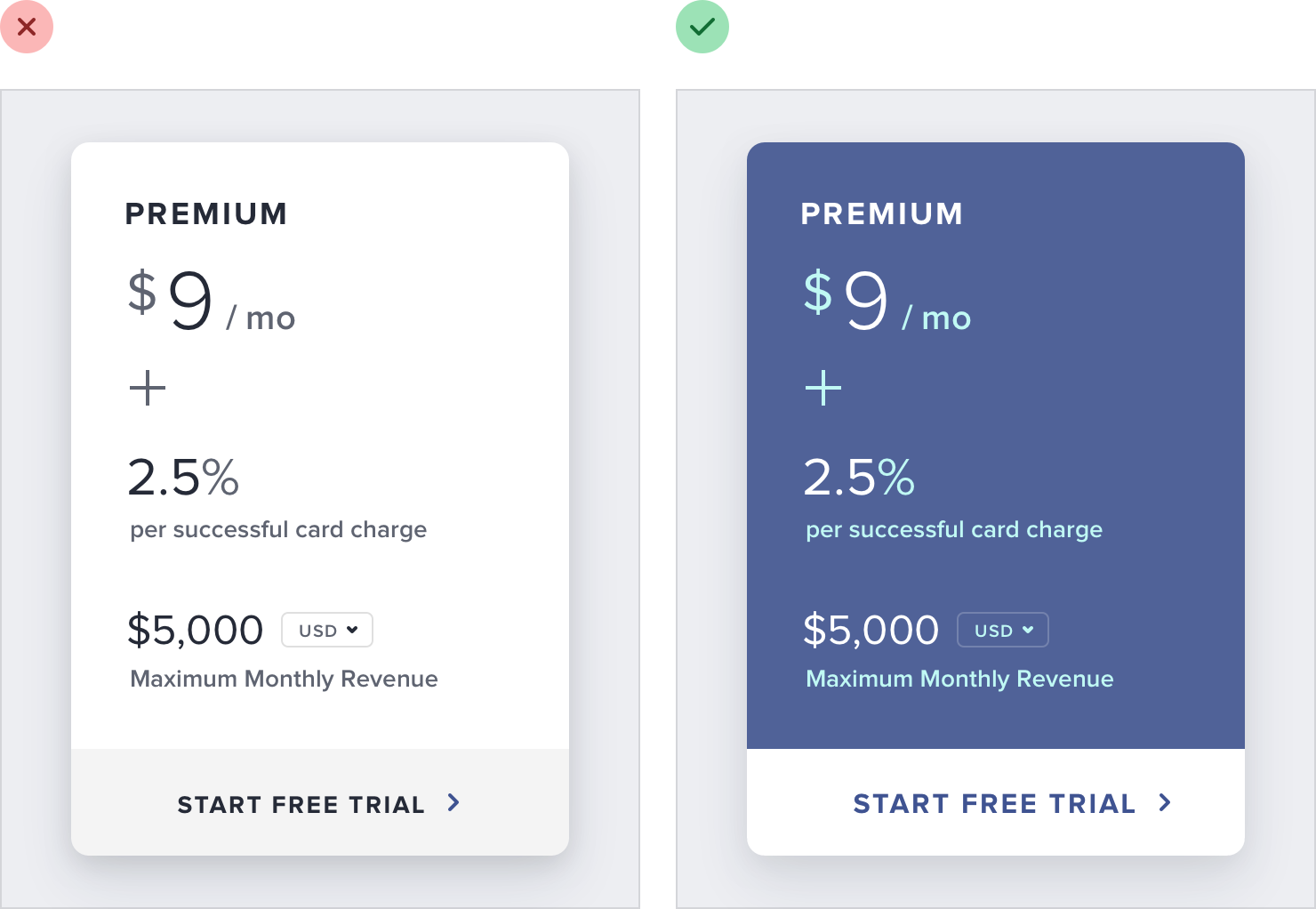
This works great for emphasizing an individual panel, as well as for adding some distinction between entire page sections.
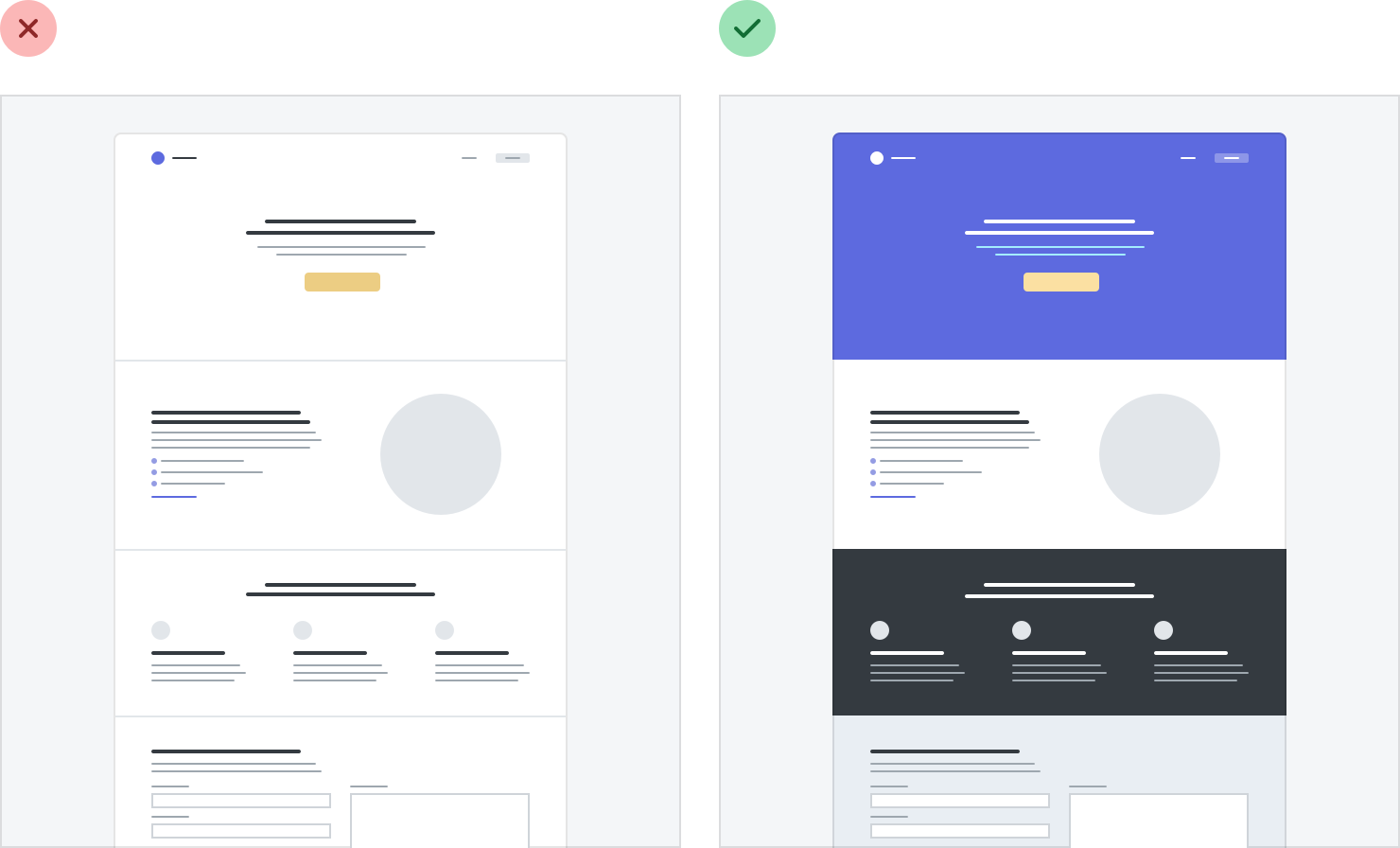
For a more energetic look, you could even use a slight gradient:
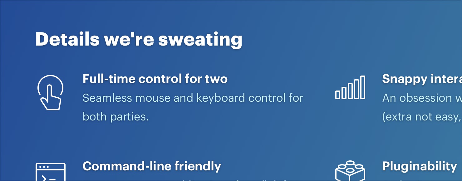
For best results, use two hues that are no more than about 30° apart.
Use a repeating pattern
Another approach is to add a subtle repeatable pattern, like this one from Hero Patterns:

You don’t have to necessarily repeat it across the entire background, either
— a pattern designed to repeat along a single edge can look great, too.
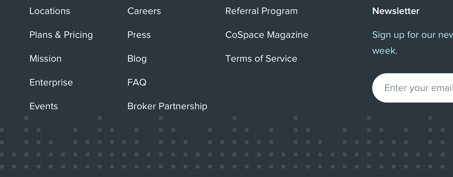
Keep the contrast between the background and the pattern pretty low to ensure readability.
Add a simple shape or illustration
Instead of decorating an entire background, you can also try including an individual graphic or two in specific positions.
Simple geometric shapes work well for this:
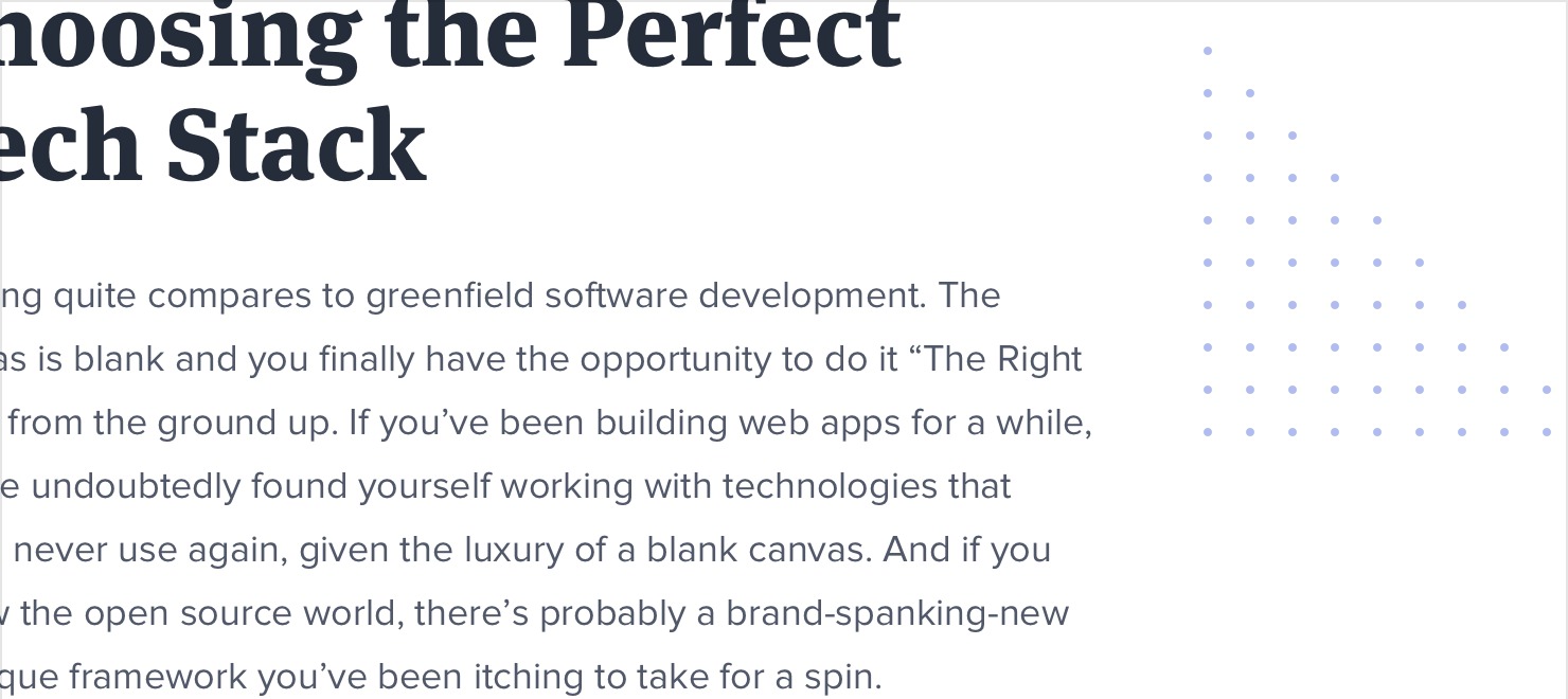
…as do small chunks of a repeatable pattern:
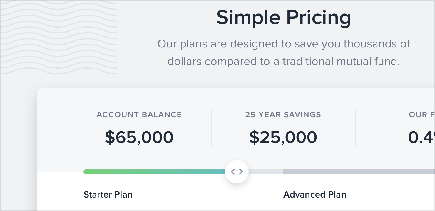
You can even do something more complex, like a simplified world map:

Just like with a full background pattern, it’s best to keep the contrast low so nothing interferes with the content.
Don’t overlook empty states
Imagine you’re designing a new feature for an app you’re working on.
You’ve spent a ton of time crafting the perfect realistic sample data, picking out usernames and avatars, and putting together a beautiful and electrifying screen.
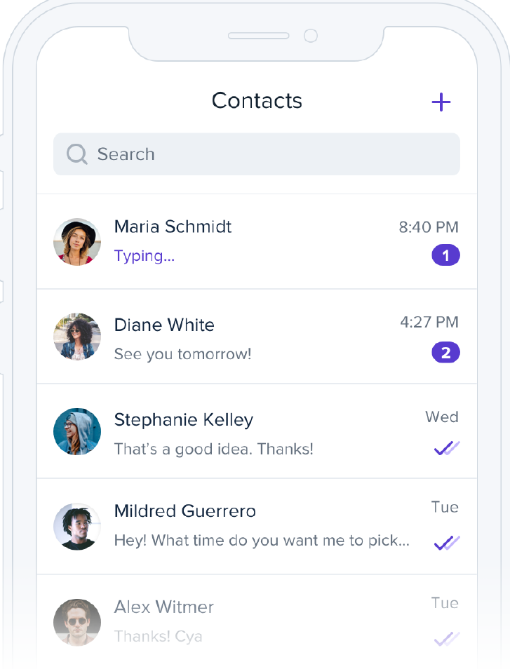
You code it all up and deploy it to production. But when an excited user clicks the new item in the nav, they see this:
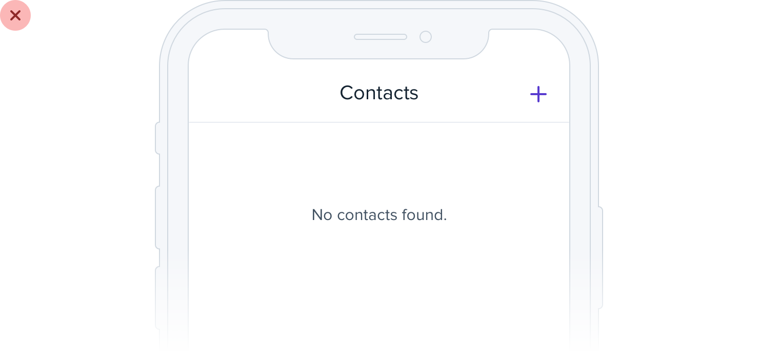
If you’re designing something that depends on user-generated content, the empty state should be a priority, not an afterthought.
Try incorporating an image or illustration to grab the user’s attention, and emphasizing the call-to-action to encourage them to take the next step:
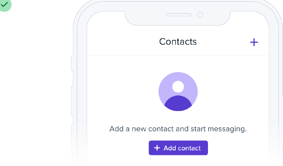
If you’re working on something that has a bunch of supporting UI like tabs or filters, consider hiding that stuff entirely. There’s no point in presenting a bunch of actions that don’t do anything until the user has created some content.
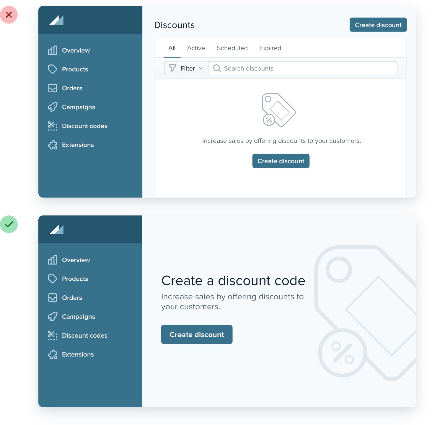
Empty states are a user’s first interaction with a new product or feature. Use them as an opportunity to be interesting and exciting — don’t settle for plain and boring.
Use fewer borders
When you need to create separation between two elements, try to resist immediately reaching for a border.
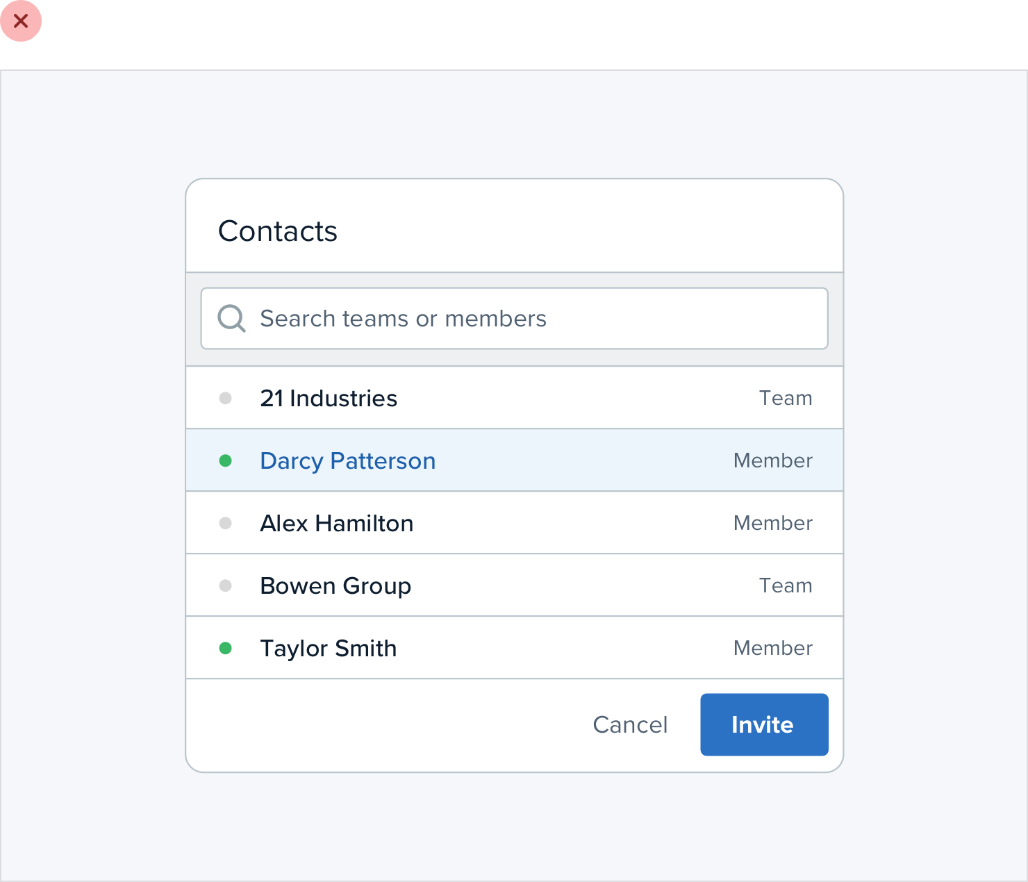
While borders are a great way to distinguish two elements from one another, they aren’t the only way, and using too many of them can make your design feel busy and cluttered.
Use a box shadow
Box shadows do a great job of outlining an element like a border would, but can be more subtle and accomplish the same goal without being as distracting.
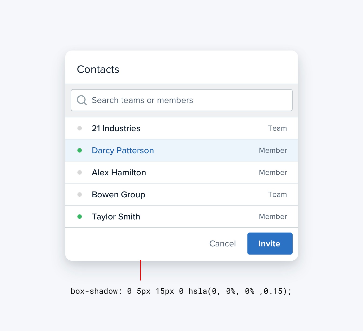
This approach works best when the element you are applying the box shadow to is not the same color as the background.
Use two different background colors
Giving adjacent elements slightly different background colors is usually all you need to create distinction between them.
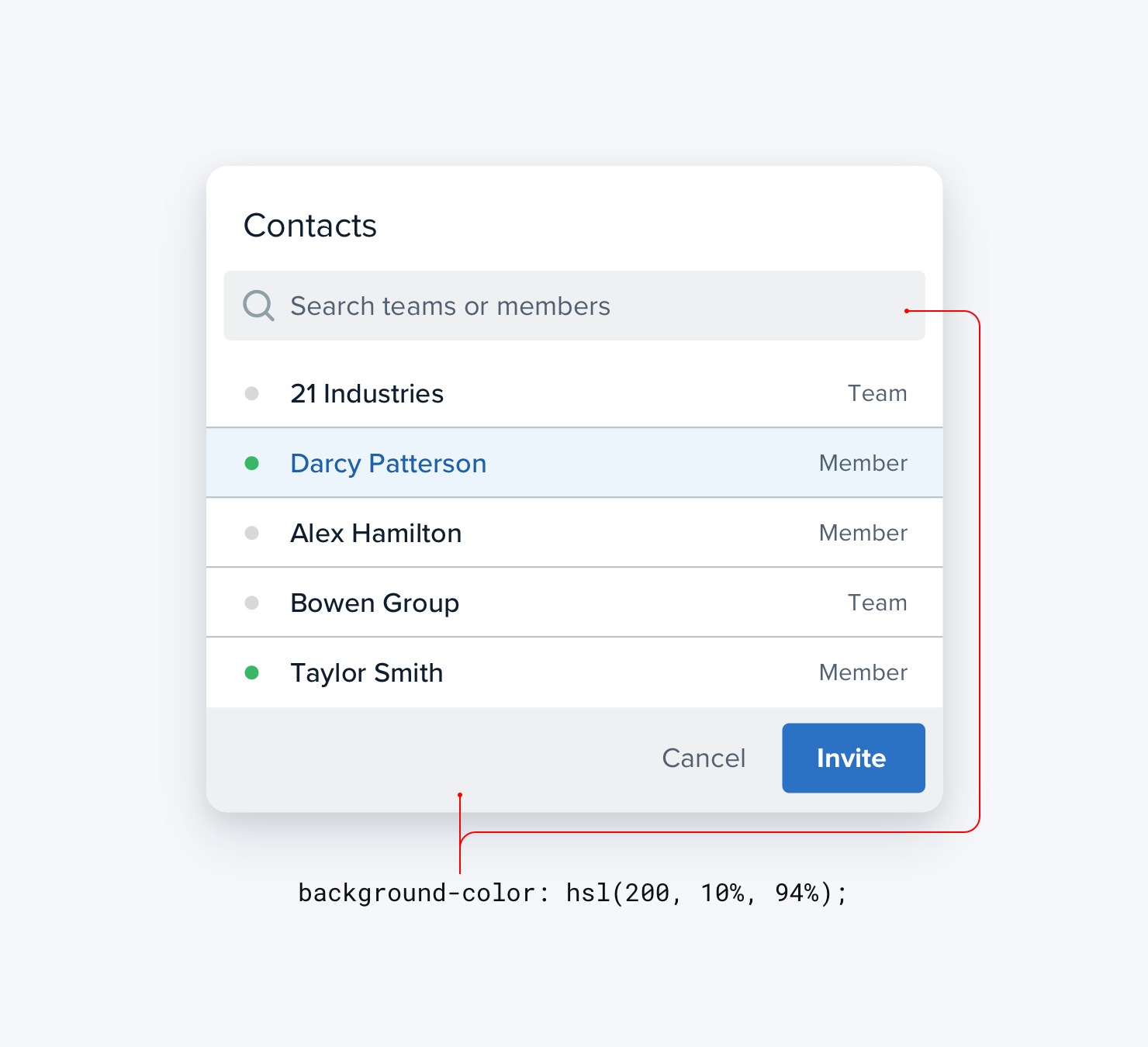
If you’re already using different background colors in addition to a border, try removing the border; you might not need it.
Add extra spacing
What better way to create separation between elements than to simply increase the separation?
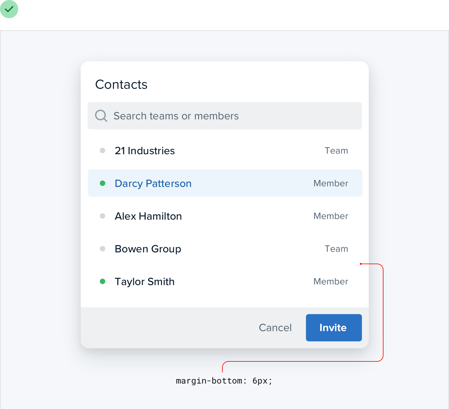
Spacing things further apart is a great way to create distinction between groups of elements without introducing any new UI at all.
Think outside the box
Most people have a lot of preconceived notions about how certain components are supposed to look. But just because we’ve been conditioned to believe that there’s only one way to design a particular component, doesn’t mean it’s true.
For example, picture a dropdown menu. You’re probably picturing a white box with a bit of a drop shadow and a list of links stacked inside of it:
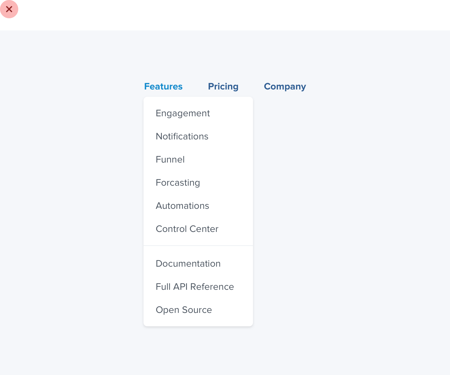
But who says a dropdown needs to be a boring list of links? It’s just a floating box on the screen, you can do anything you want with it.
Break it into sections, use multiple columns, add supporting text or colorful icons — do something fun with it!
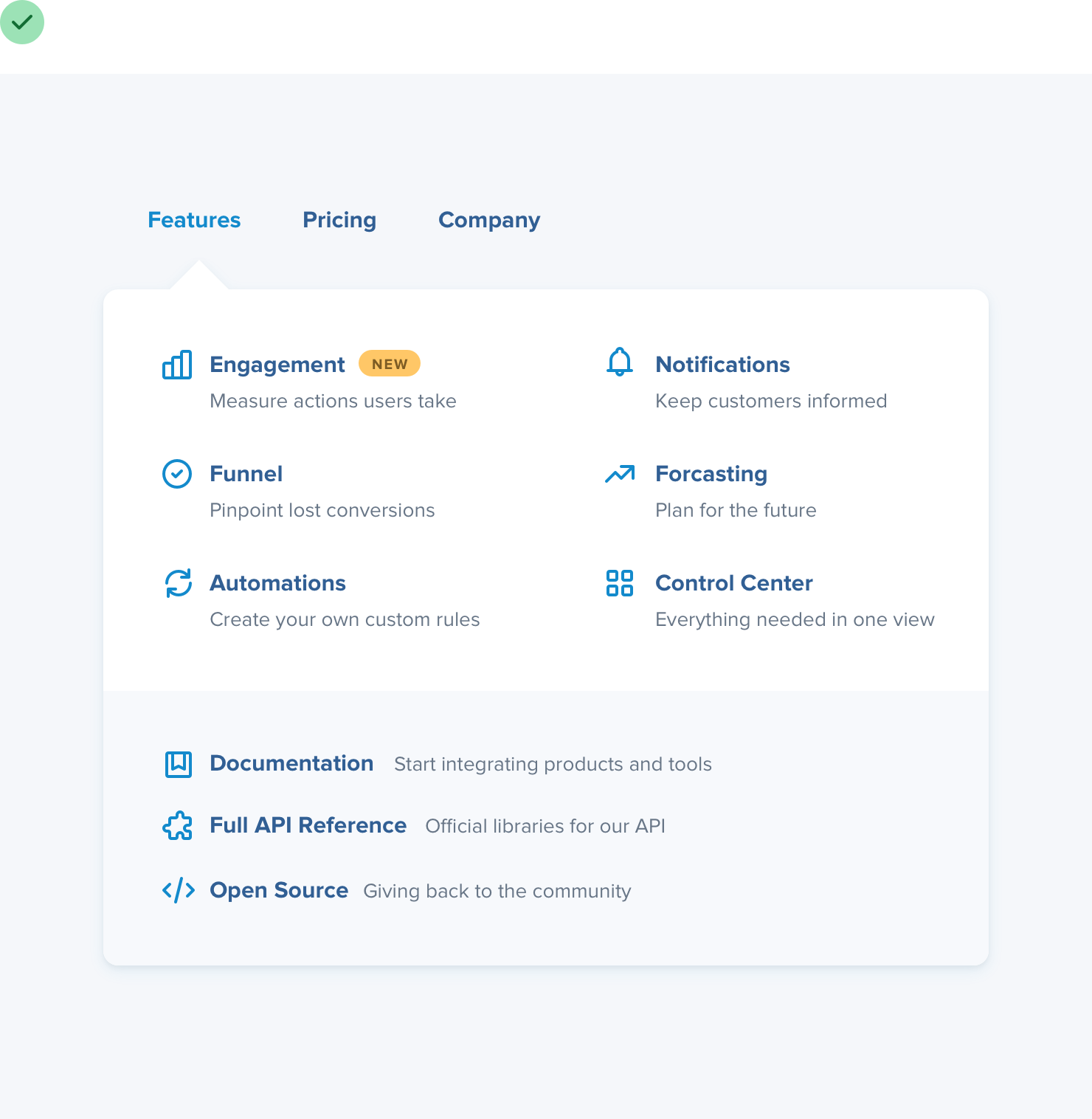
And don’t just stop at dropdowns; what about something like a table?
When you imagine a table, you probably think of columns that each contain one specific piece of data:
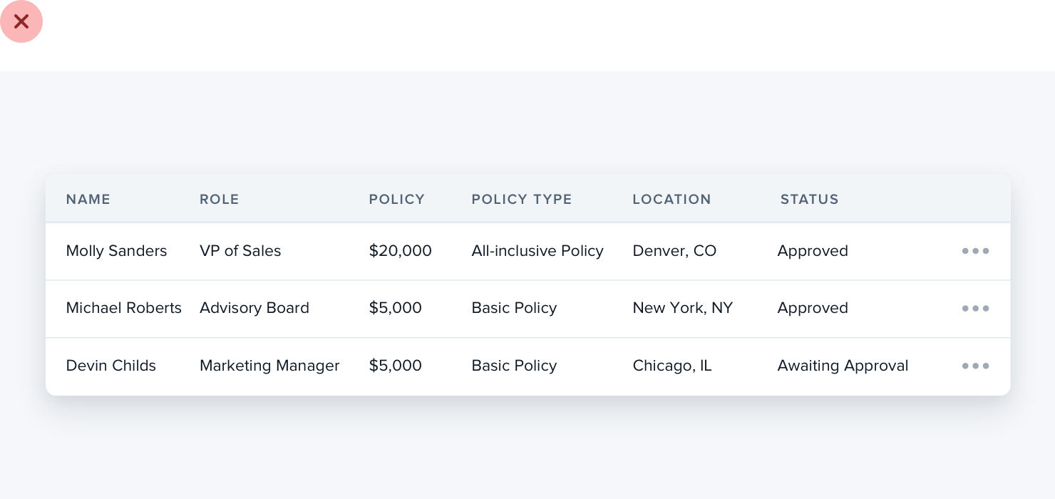
Tables don’t have to work this way, though — if a column doesn’t need to be sortable, there’s no reason you can’t combine it with a related column and introduce some interesting hierarchy:
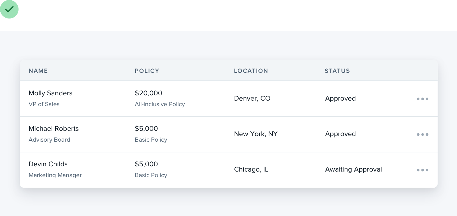
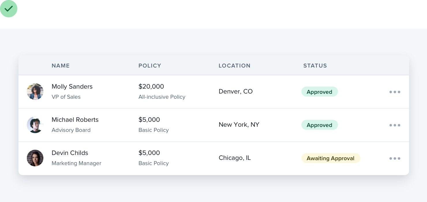
Table content doesn’t have to be plain text, either. Add images if it makes sense, or introduce some color to enrich the existing data:
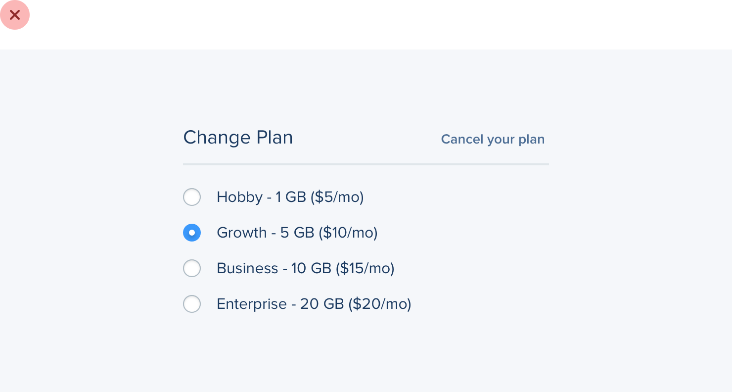
How about radio buttons? There’s nothing more boring than a stack of labels with little circles next to them.
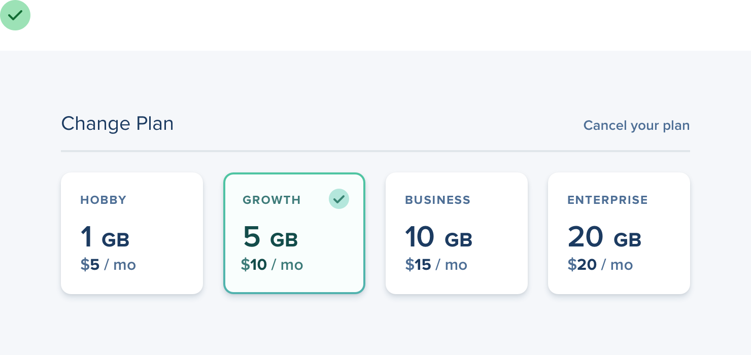
If a set of radio buttons are an important part of the UI you’re designing, try something like selectable cards instead:
Don’t let your existing beliefs hold back your designs — constraints are powerful but sometimes a bit of freedom is just what you need to take an interface to the next level.