Chapter 7
Working with Images
Use good photos
Bad photos will ruin a design, even if everything else about it looks great.

If your design needs photography and you’re not a talented photographer, you’ve got two options:
-
Hire a professional photographer.
If you need very specific photos for your project, entrust a professional. Taking great photos isn’t just about using an expensive camera, it’s about lighting, composition, color — skills that take years to develop.
Use good photos 175

-
Use high quality stock photography.
If your needs are more generic, there are tons of great resources out there where you can purchase great stock photos. There are even sites like Unsplash that offer beautiful photography for free.
Whatever you do, don’t design using placeholder images and expect to be able to take some photos with your smartphone and swap them in later. It never works.
Text needs consistent contrast
Ever tried to slap a headline on a big hero image, only to find that no matter what color you tried for the text, it was still hard to read?

That’s because the problem isn’t the text, it’s the image.
The problem with background images
Photos can be very dynamic, with a lot of really light areas, and a lot of really dark areas. White text might look great in the dark areas, but it gets lost in the light areas. Dark text looks great in the light areas, but gets lost in the dark areas.
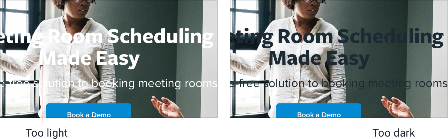
To solve this problem, you need to reduce the dynamics in the image to make the contrast between the text and the background more consistent.
Add an overlay
One way to increase the overall text contrast is to add a semi-transparent overlay to the background image.

A black overlay will tone down the light areas and help light text stand out, while a white overlay will brighten up the dark areas and help dark text stand out.
Lower the image contrast
One of the compromises you make when using an overlay is that you’re lightening or darkening the whole image, not just the problem areas.
If you want more control, another solution is to lower the contrast of the image itself:

Lowering the contrast will change how light or dark the image feels overall, so make sure to adjust the brightness to compensate.
Colorize the image
Another way to help text stand out against an image is to colorize the image with a single color.
Some photo editing software includes this as a first-class feature, but if yours doesn’t, you can create this effect in three steps:
-
Lower the image contrast, to balance things out a bit.
-
Desaturate the image, to remove any existing color.
-
Add a solid fill, using the “multiply” blend mode.

This can also be a great way to make a background image pair more nicely with your existing brand colors.
Add a text shadow
If you want to preserve a bit more of the dynamics in a background image, a text shadow can be a great way to increase contrast only where you need it most.
You want it to look more like a subtle glow than an actual shadow, so use a large blur radius and don’t add any kind of offset.

It’s still a good idea to reduce the overall image contrast, but combining that with a text shadow means you can reduce it a little less.
Everything has an intended size
Everyone knows that scaling bitmap images to larger than their original size is a bad idea — they immediately feel “fuzzy” and lose their definition.

But that’s not the only way you can go wrong with scaling, even when you think you’re playing it safe.
Don’t scale up icons
If you’re designing something that could use some large icons (like maybe the “features” section of a landing page), you might instinctively grab your favorite SVG icon set and bump up the size until they fit your needs.
They’re vector images after all, so the quality isn’t going to suffer if you increase the size, right?

While it’s true that vector images won’t degrade in quality when you increase their size, icons that were drawn at 16–24px are never going to look very professional when you blow them up to 3x or 4x their intended size. They lack detail, and always feel disproportionately “chunky”.
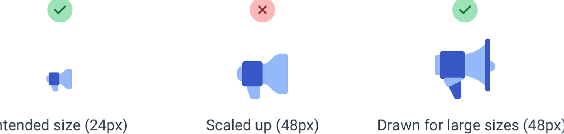
If small icons are all you’ve got, try enclosing them inside another shape and giving the shape a background color:

This lets you keep the actual icon closer to its intended size, while still filling the larger space.

Don’t scale down screenshots
Say you want to include a screenshot of your app on that same features page.
If you take a full-size screenshot and shrink it by 70% to make it fit, you’ll end up with an image that’s trying to cram way too much detail into far too little space.
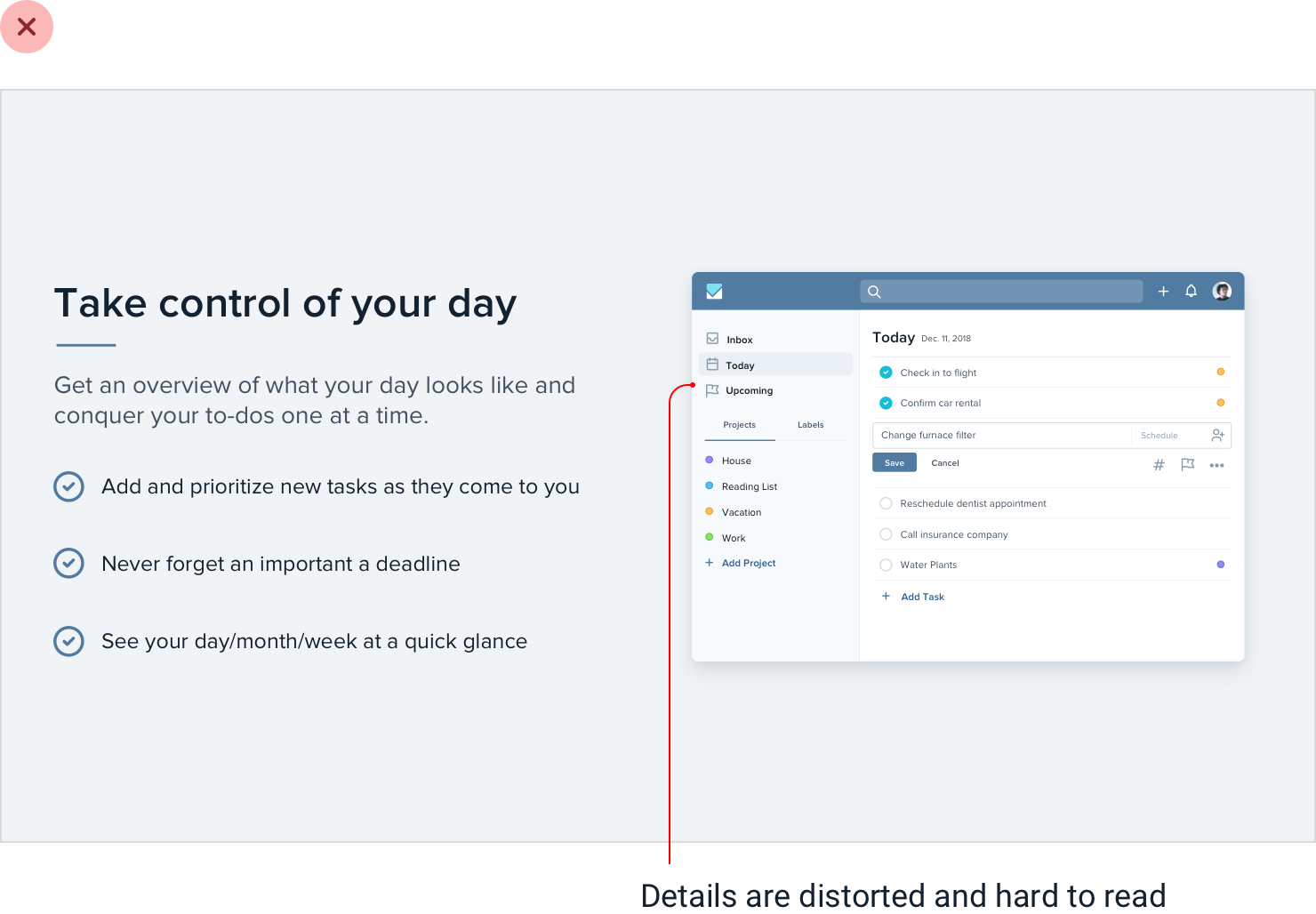
The 16px font in your app becomes a 4px font in your screenshot, and visitors will be squinting with their eyeballs two inches from the screen, struggling to make out what all that text says.
If you want to include a detailed screenshot in your design, take the screenshot at a smaller screen size (like maybe your tablet layout) and save a
lot of space for it so you don’t have to shrink it as much:
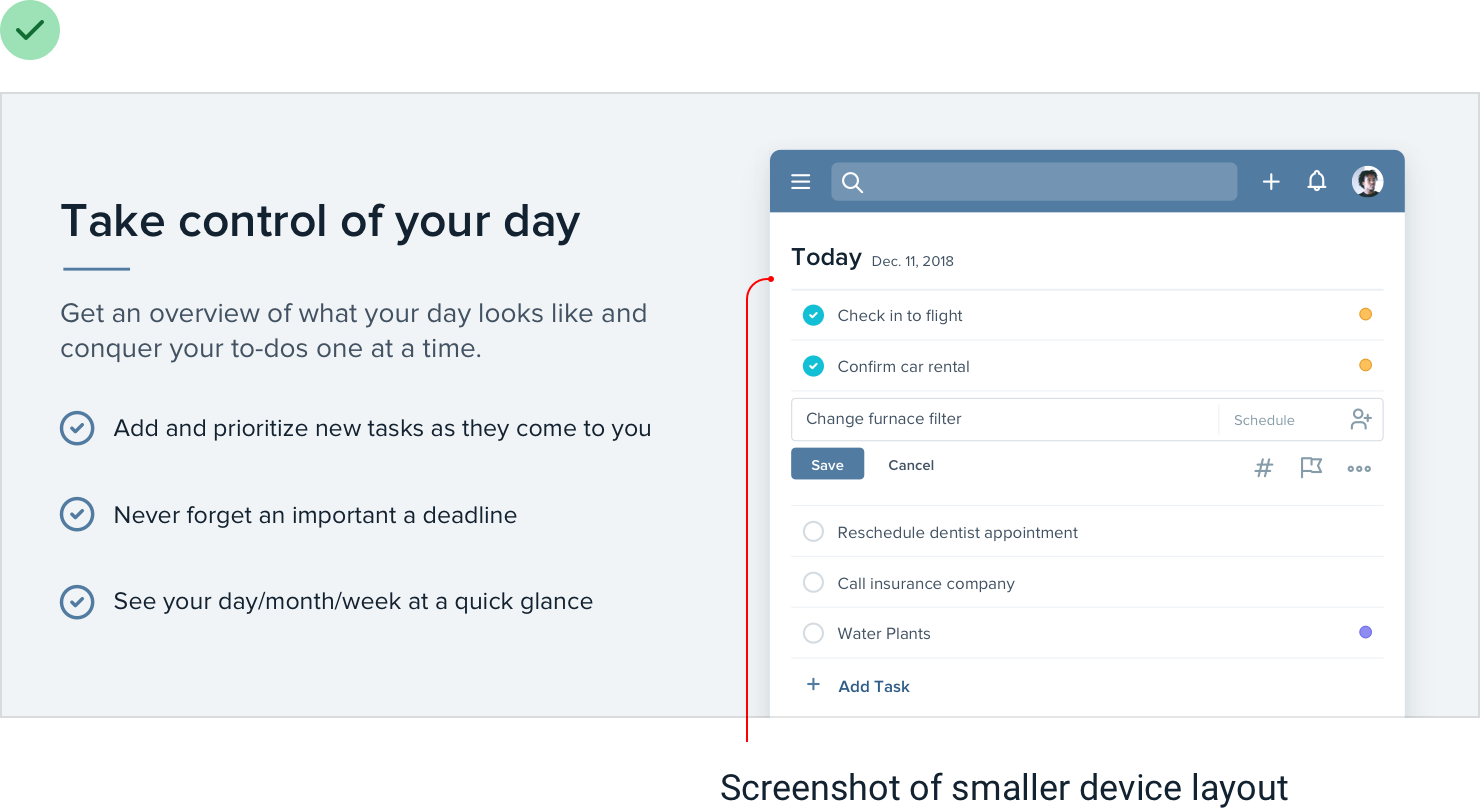
Or consider taking just a partial screenshot, so you can display it in less space without needing to scale it down:
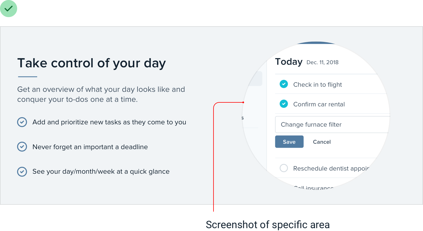
If you really need to fit a whole-app screenshot in a tight space, try drawing a simplified version of the UI with details removed and small text replaced with simple lines:
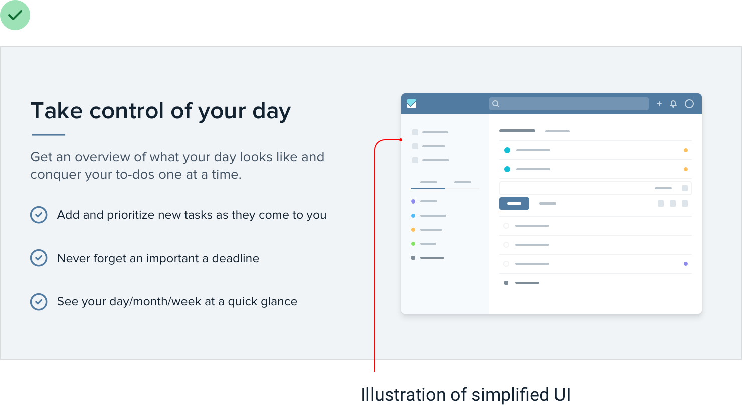
It’ll still communicate the big-picture design without tempting visitors to try and make out all of the details.
Don’t scale down icons, either
Just as icons drawn to be used at 16px look chunky when you scale them up, icons intended to be used at larger sizes look choppy and fuzzy when you scale them down.
The most extreme example of this are favicons, those little icons you see next to the page title in a browser tab.
If you try to shrink a logo drawn at 128px down to favicon size, it all turns to
mush as the browser tries its best to render all of that detail in a tiny 16px square:

A better approach is to redraw a super simplified version of the logo at the target size, so you control the compromises instead of leaving it up to the browser:

Beware user-uploaded content
When you’re depending on user-uploaded images, you don’t have the luxury of fine-tuning contrast, carefully adjusting colors, or cropping the perfect frame.
While you’ll always be at your users’ mercy to some extent, there are a few things you can do to make sure their content doesn’t completely undermine your design.
Control the shape and size
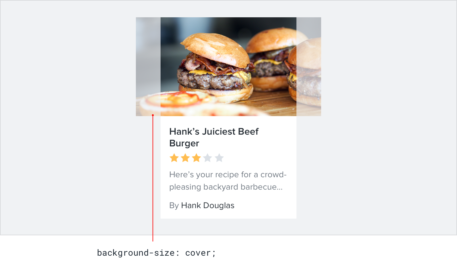
Displaying user-uploaded images at their intrinsic aspect ratio can really throw off a layout, especially if there are a lot of images on the screen at once.

Instead of letting users wreak havoc on your page structure, center their images inside fixed containers, cropping out anything that doesn’t fit.

This is really easy to do with CSS these days by making the image a background image, and setting the background-size property to cover.
Prevent background bleed
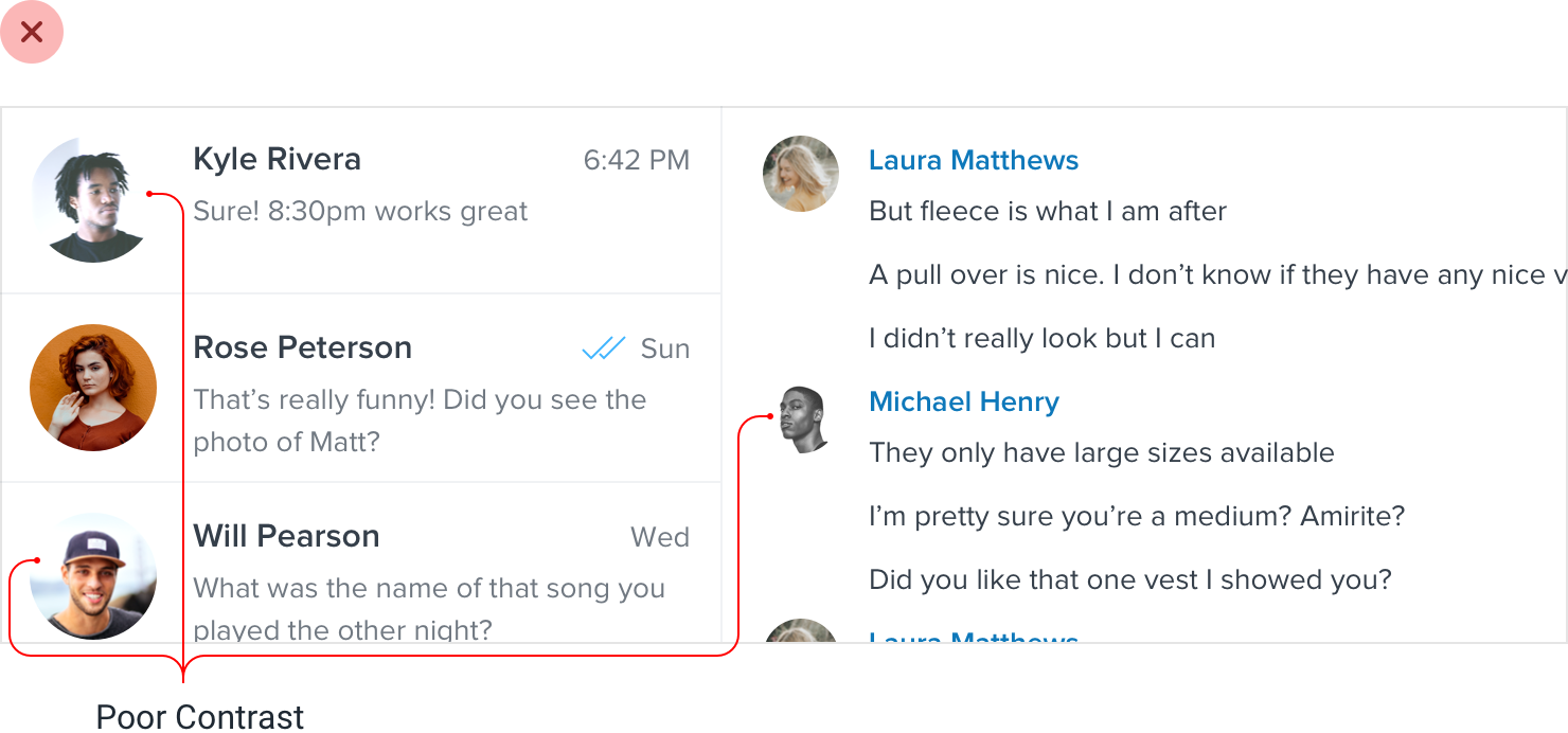
When a user provides an image with a background color that’s similar to the background in your UI, the image and the background can bleed together, causing the image to lose its shape.
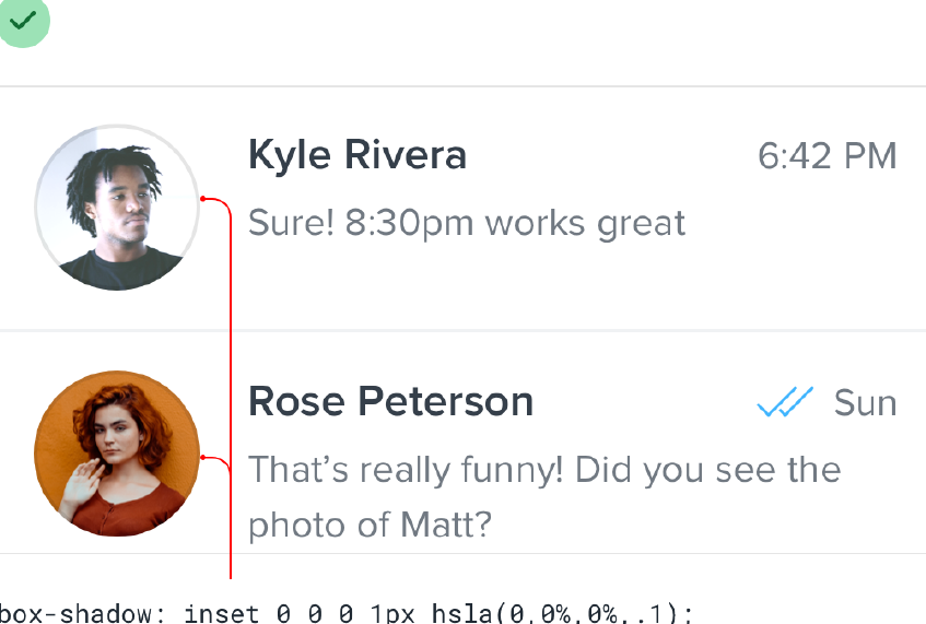
Instead of trying to solve this with a border, try using a subtle inner box shadow:
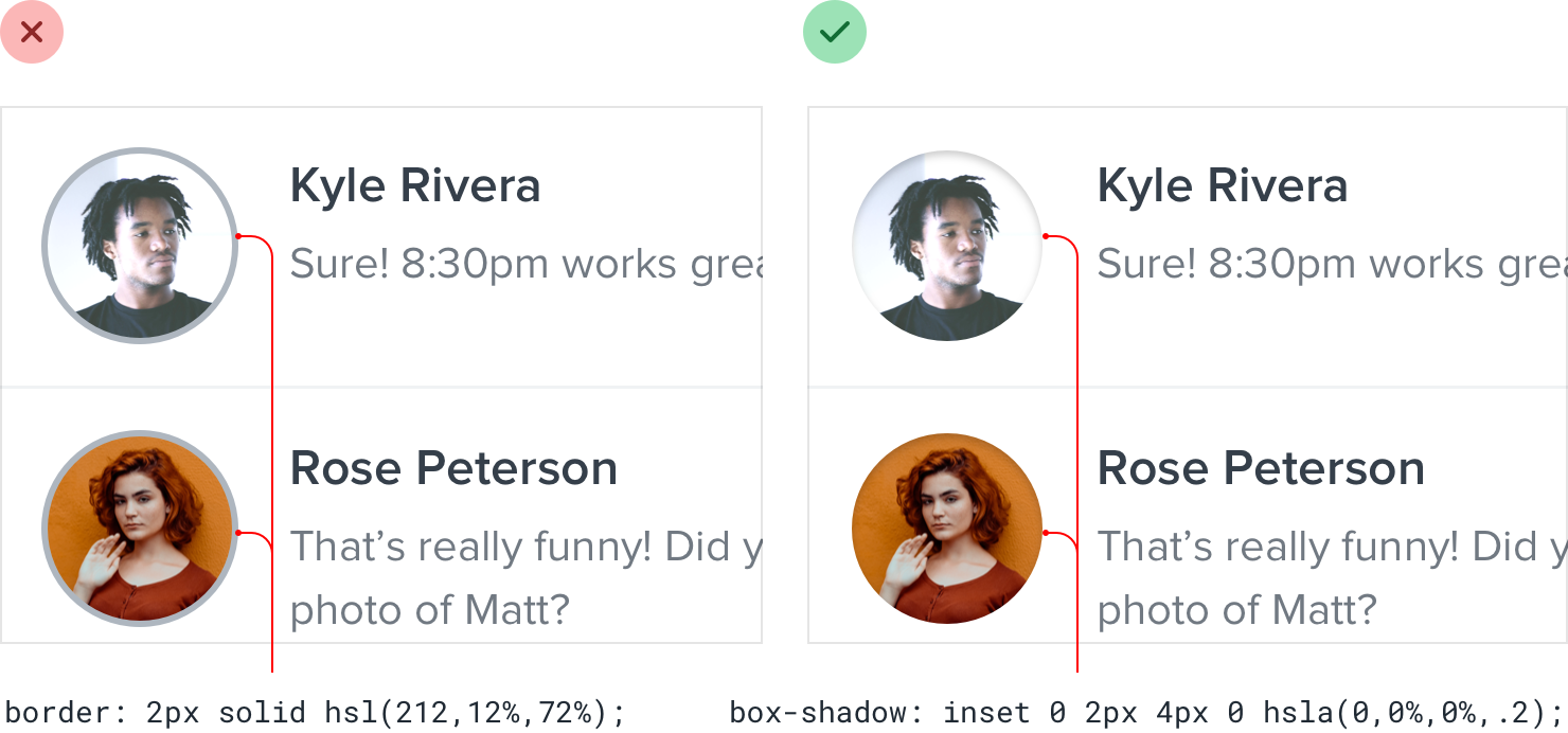
Borders will often clash with the colors in the image, while most people will barely even realize the shadow is there.
If you don’t like the slight “inset” look you get from using a box shadow, a semi-transparent inner border works great, too.