Chapter 5
Working with Color
Ditch hex for HSL
Hex and RGB are the most common formats for representing color on the web, but they’re not the most useful.
Using hex or RGB, colors that have a lot in common visually look nothing alike in code.
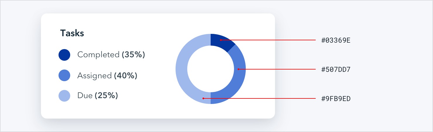
HSL fixes this by representing colors using attributes the human-eye intuitively perceives: hue, saturation, and lightness.
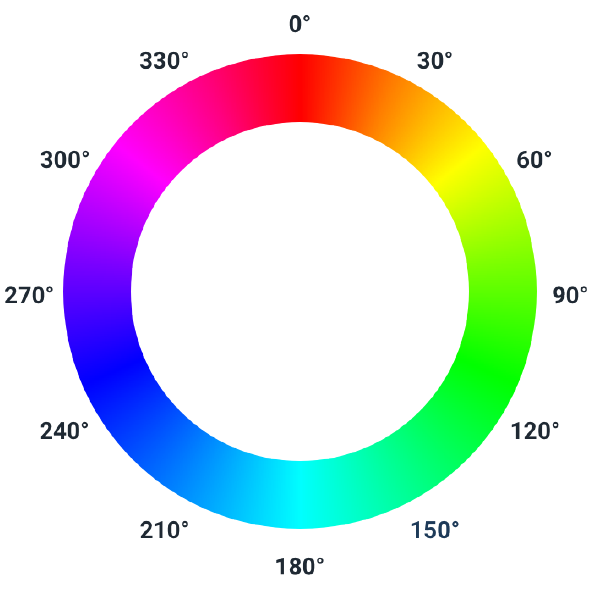
Hue is a color’s position on the color wheel — it’s the attribute of a color that lets us identify two colors as “blue” even if they aren’t identical.
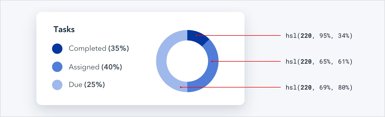
Hue is measured in degrees, where 0° is red, 120° is green, and 240° is blue.
Saturation is how colorful or vivid a color looks. 0% saturation is grey (no color), and 100% saturation is vibrant and intense.
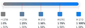
Without saturation, hue is irrelevant — rotating the hue when saturation is 0% doesn’t actually change the color at all.
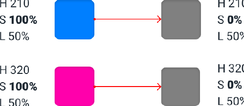
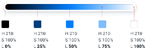
Lightness is just what it sounds like — it measures how close a color is to black or to white. 0% lightness is pure black, 100% lightness is pure white, and 50% lightness is a pure color at the given hue.
HSL vs. HSB
Don’t confuse HSL for HSB — lightness in HSL is not the same as brightness
in HSB.
In HSB, 0% brightness is always black, but 100% brightness is only white when the saturation is 0%. When saturation is 100%, 100% brightness in HSB is the same as 100% saturation and 50% lightness in HSL.
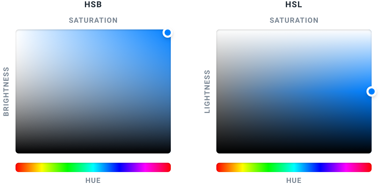
HSB is more common than HSL in design software, but browsers only understand HSL, so if you’re designing for the web, HSL should be your weapon of choice.
You need more colors than you think
Ever used one of those color palette generators where you pick a starting color, tweak some options, and are then bestowed the five perfect colors you should use to build your website?

This calculated approach to picking the perfect color scheme is extremely seductive, but it’s not very useful unless you want your site to look like this:

What you actually need
You can’t build anything with five hex codes. To build something real, you need a much more comprehensive set of colors to choose from.
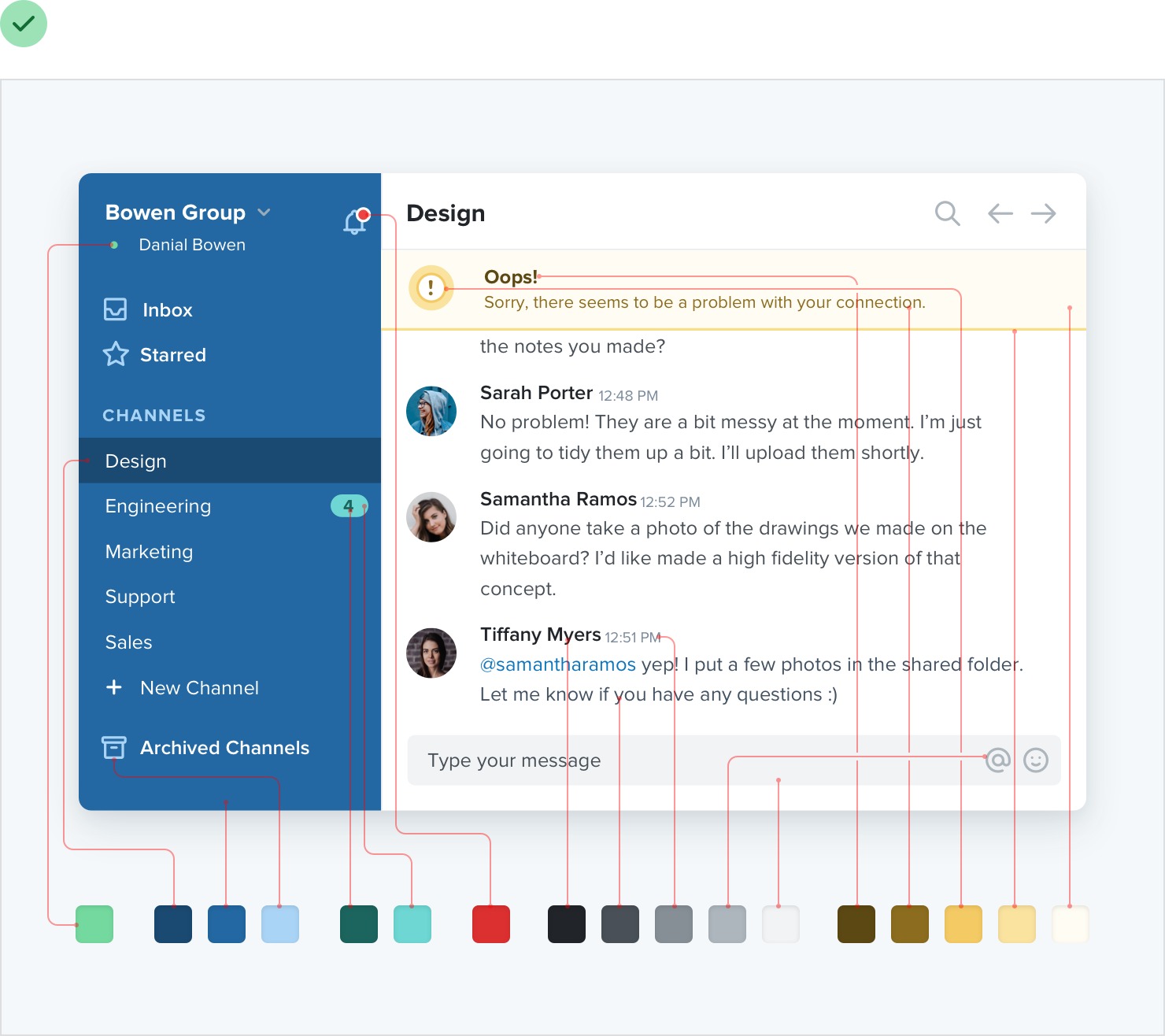
You can break a good color palette down into three categories.
Greys
Text, backgrounds, panels, form controls — almost everything in an interface is grey.
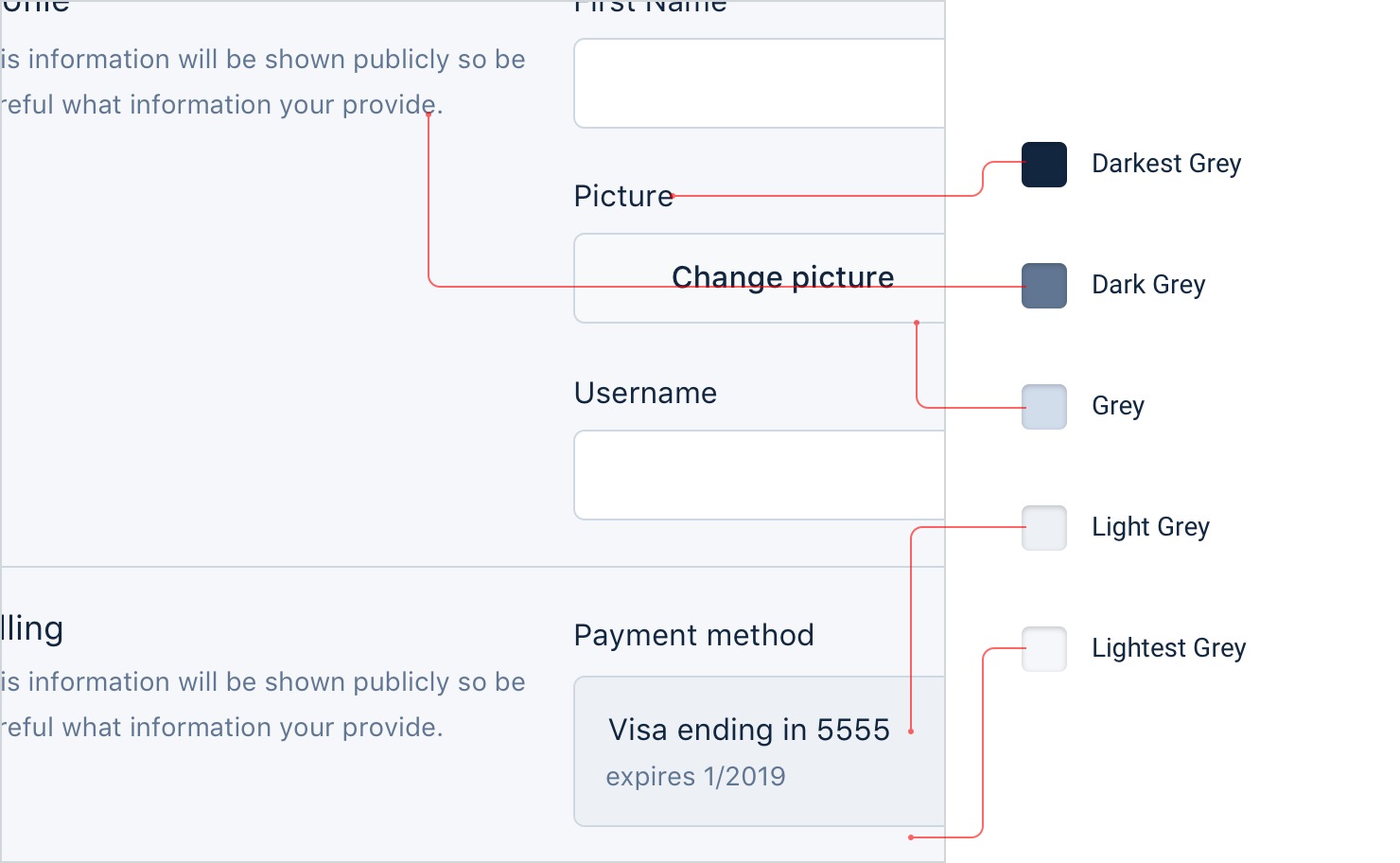
You’ll need more greys than you think, too — three or four shades might sound like plenty but it won’t be long before you wish you had something a little darker than shade #2 but a little lighter than shade #3.
In practice, you want 8-10 shades to choose from (more on this in “Define your shades up front”). Not so many that you waste time deciding between shade #77 and shade #78, but enough to make sure you don’t have to compromise too much.

True black tends to look pretty unnatural, so start with a really dark grey and work your way up to white in steady increments.
Primary color(s)
Most sites need one, maybe two colors that are used for primary actions, active navigation elements, etc. These are the colors that determine the overall look of a site — the ones that make you think of Facebook as “blue”.
Just like with greys, you need a variety (5-10) of lighter and darker shades to choose from.
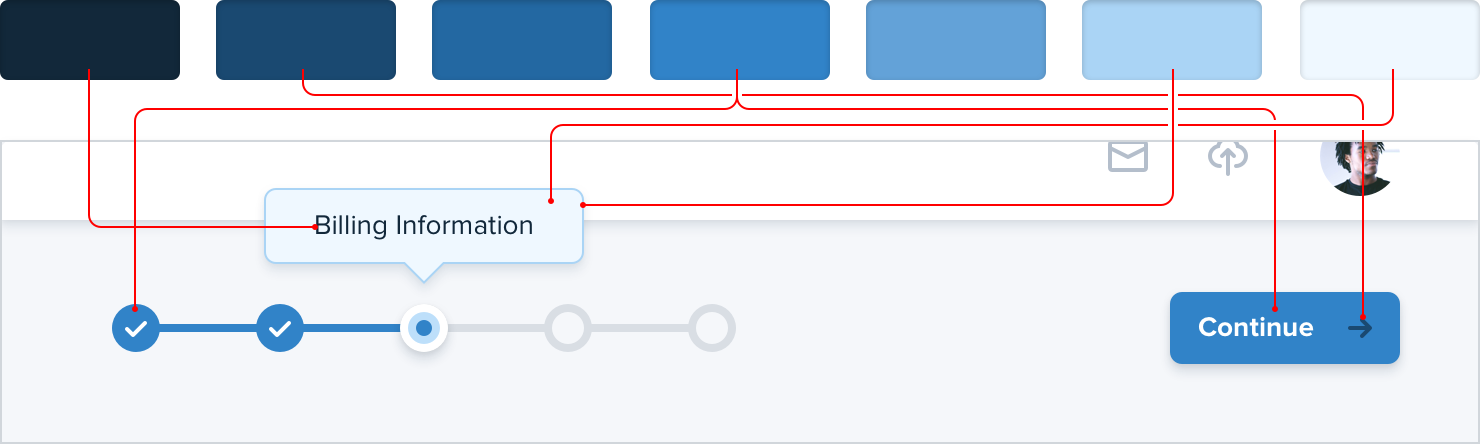
Ultra-light shades can be useful as a tinted background for things like alerts, while darker shades work great for text.
Accent colors
On top of primary colors, every site needs a few accent colors for communicating different things to the user.
For example, you might want to use an eye-grabbing color like yellow, pink, or teal to highlight a new feature:

You might also need colors to emphasize different semantic states, like red for confirming a destructive action:
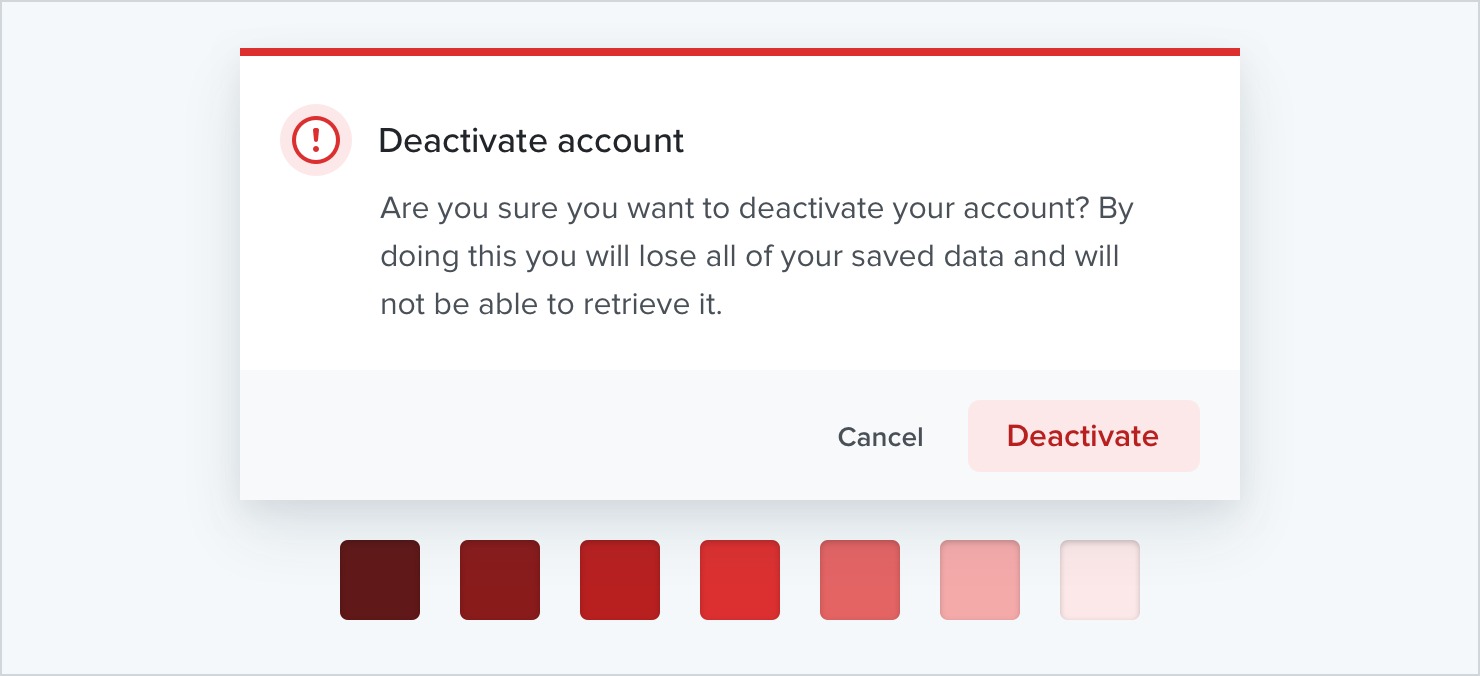
…yellow for a warning message:

…or green to highlight a positive trend:

You’ll want multiple shades for these colors too, even though they should be used pretty sparingly throughout the UI.
If you’re building something where you need to use color to distinguish or categorize similar elements (like lines on graphs, events in a calendar, or tags on a project), you might need even more accent colors.
All in, it’s not uncommon to need as many as ten different colors with 5-10 shades each for a complex UI.
Define your shades up front
When you need to create a lighter or darker variation of a color in your palette, don’t get clever using CSS preprocessor functions like “lighten” or “darken” to create shades on the fly. That’s how you end up with 35 slightly different blues that all look the same.
Instead, define a fixed set of shades up front that you can choose from as you work.
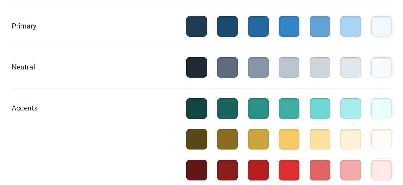
So how do you put together a palette like this anyways?
Choose the base color first
Start by picking a base color for the scale you want to create — the color in the middle that your lighter and darker shades are based on.
There’s no real scientific way to do this, but for primary and accent colors, a good rule of thumb is to pick a shade that would work well as a button background.

It’s important to note that there are no real rules here like “start at 50% lightness” or anything — every color behaves a bit differently, so you’ll have to rely on your eyes for this one.
Finding the edges
Next, pick your darkest shade and your lightest shade. There’s no real science to this either, but it helps to think about where they will be used and choose them using that context.
The darkest shade of a color is usually reserved for text, while the lightest shade might be used to tint the background of an element.
A simple alert component is a good example that combines both of these use cases, so it can be a great place to pick these colors.
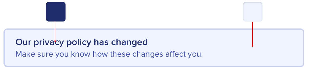
Start with a color that matches the hue of your base color, and adjust the saturation and lightness until you’re satisfied.
Filling in the gaps
Once you’ve got your base, darkest, and lightest shades, you just need to fill in the gaps in between them.
For most projects, you’ll need at least 5 shades per color, and probably closer to 10 if you don’t want to feel too constrained.
Nine is a great number because it’s easy to divide and makes filling in the gaps a little more straightforward. Let’s call our darkest shade 900, our base shade 500, and our lightest shade 100.

Start by picking shades 700 and 300, the ones right in the middle of the gaps. You want these shades to feel like the perfect compromise between the shades on either side.

This creates four more holes in the scale (800, 600, 400, and 200), which you can fill using the same approach.

You should end up with a pretty balanced set of colors that provide just enough options to accommodate your design ideas without feeling limiting.
What about greys?
With greys the base color isn’t as important, but otherwise the process is the same. Start at the edges and fill in the gaps until you have what you need.

Pick your darkest grey by choosing a color for the darkest text in your project, and your lightest grey by choosing something that works well for a subtle off-white background.
It’s not a science
As tempting as it is, you can’t rely purely on math to craft the perfect color palette.
A systematic approach like the one described above is great to get you started, but don’t be afraid to make little tweaks if you need to.
Once you actually start using your colors in your designs, it’s almost inevitable that you’ll want to tweak the saturation on a shade, or make a couple of shades lighter or darker. Trust your eyes, not the numbers.
Just try to avoid adding new shades too often if you can avoid it. If you’re not diligent about limiting your palette, you might as well have no color system at all.
Don’t let lightness kill your saturation
In the HSL color space, as a color gets closer to 0% or 100% lightness, the impact of saturation is weakened — the same saturation value at 50% lightness looks more colorful than it does at 90% lightness.
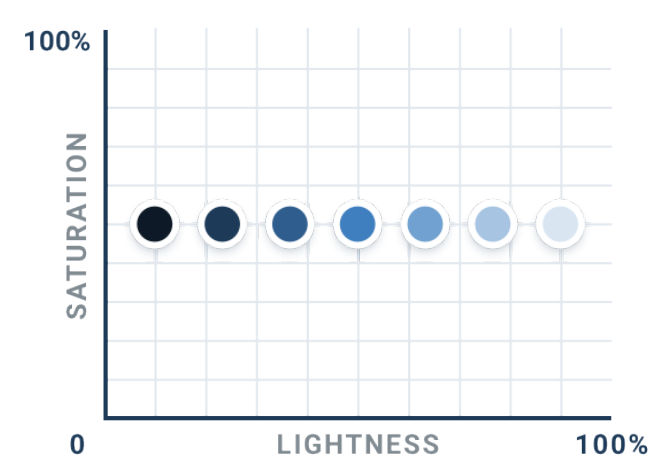
That means that if you don’t want the lighter and darker shades of a given color to look washed out, you need to increase the saturation as the lightness gets further away from 50%.
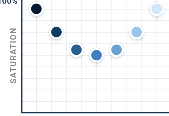
It’s subtle but little details like this add up, especially when a color is being applied to a large section of a UI.
But what if your base color is already heavily saturated? How do you increase the saturation if it’s already at 100%?
Use perceived brightness to your advantage
Which of these two colors do you think is lighter?

The yellow, right? Well it turns out both colors actually have the exact same “lightness” in terms of HSL:

So why do we see the yellow as lighter? Well it turns out that every hue has an inherent perceived brightness due to how the human eye perceives color.
You can calculate the perceived brightness of a color by plugging its RGB components into this formula:

Taking samples of different hues with 100% saturation and 50% lightness, we can get a good sense of the perceived brightness of different colors around the color wheel:
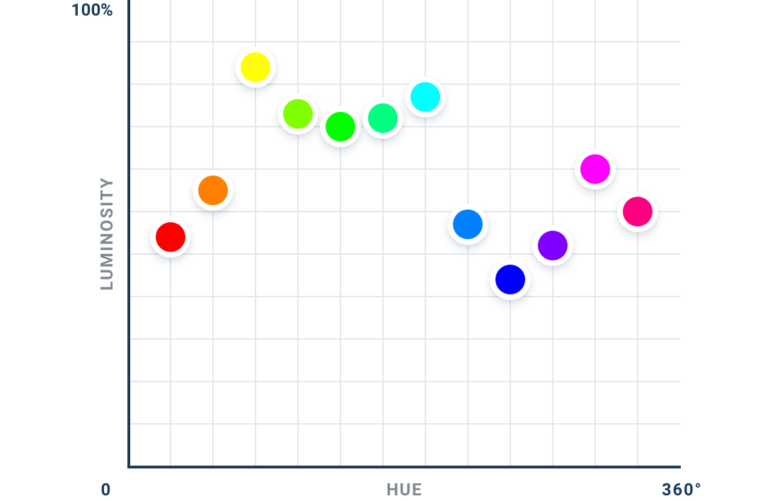
As expected, yellow has a higher perceived brightness than blue. But what’s interesting here is that perceived brightness doesn’t simply change linearly from the darkest hue to the lightest hue — instead, there are three separate local minimums (red, green, and blue) and three local maximums (yellow, cyan, and magenta).
Changing brightness by rotating hue
On the surface, this is certainly an interesting thing to understand about color. But things get really interesting when you realize how you can use this knowledge in your designs.
Normally when you want to change how light a color looks, you adjust the
lightness component:
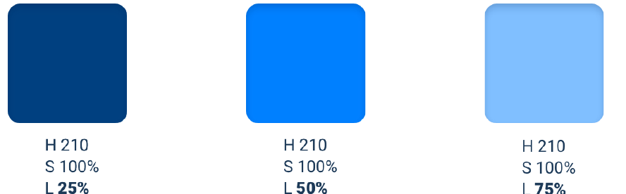
While this does work to lighten or darken a color, you often lose some of the color’s intensity — the color also looks closer to white or to black, not just lighter or darker.

Since different hues have a different perceived brightness, another way you can change the brightness of a color is by rotating its hue.
To make a color lighter, rotate the hue towards the nearest bright hue — 60°, 180°, or 300°.

To make a color darker, rotate the hue towards the nearest dark hue — 0°, 120°, or 240°.

This can be really useful when trying to create a palette for a light color like yellow. By gradually rotating the hue towards more of an orange as you decrease the lightness, the darker shades will feel warm and rich instead of dull and brown:

You can of course combine these approaches too, getting some of the brightness by adjusting the hue and some from adjusting the lightness.

While this is a great way to change a color’s brightness without affecting its intensity, it works best in small doses. Don’t rotate the hue more than 20-30° or it will look like a totally different color instead of just lighter or darker.
Greys don’t have to be grey
By definition, true grey has a saturation of 0% — it doesn’t have any actual
color in it at all.
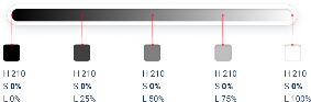
But in practice, a lot of the colors that we think of as grey are actually saturated quite heavily:
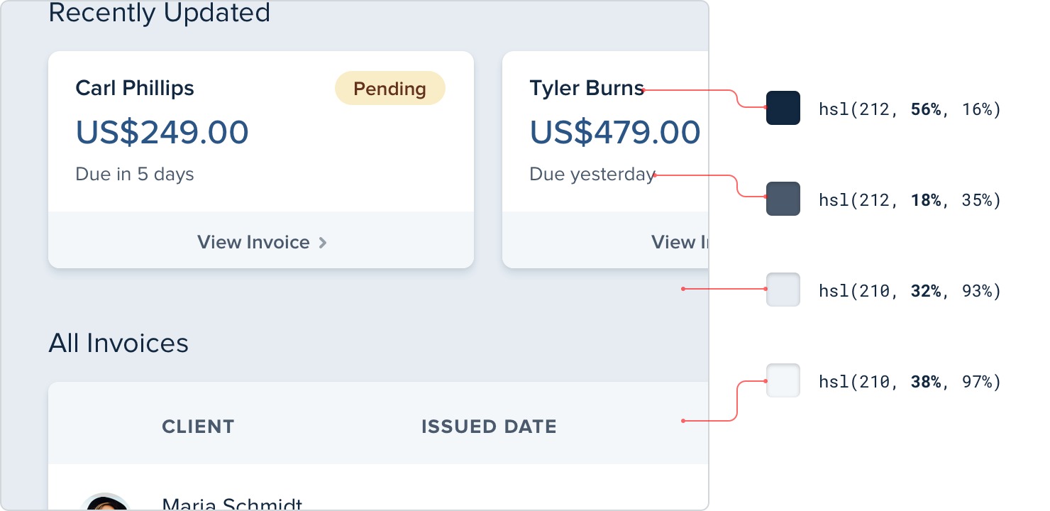
This saturation is what makes some greys feel cool and other greys feel warm.
Color temperature
If you’ve ever purchased light bulbs before, you’ve had to make the decision between “warm white” bulbs that give off a yellow-ish light, and “cool white” bulbs that give off a blue-ish light.
Saturating greys in a user interface works in a similar same way.
If you want your greys to feel cool, saturate them with a bit of blue:
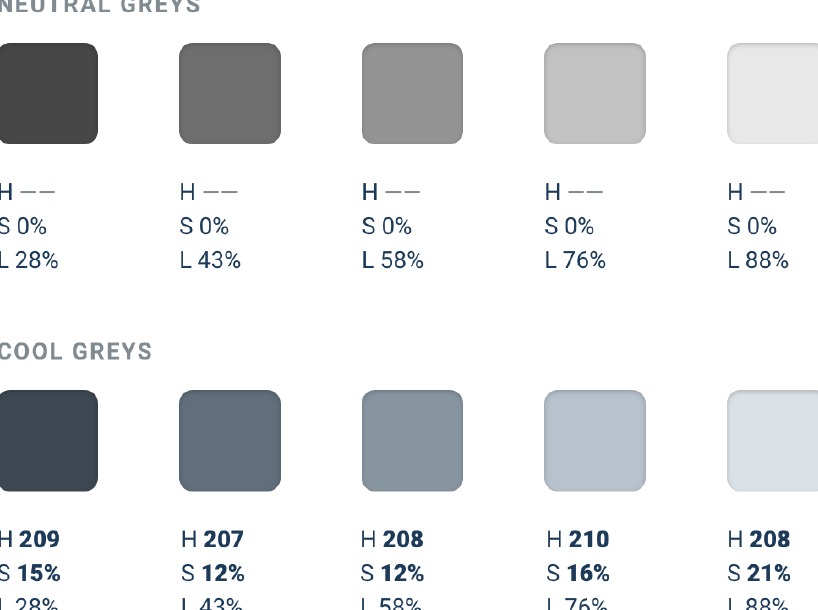
To give your greys a warmer feel, saturate them with a bit of yellow or orange:
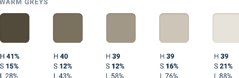
To maintain a consistent temperature, don’t forget to increase the saturation for the lighter and darker shades. If you don’t, those shades will look a bit washed out compared to the greys that are closer to 50% lightness.
How much you want to saturate your greys is completely up to you — add just a little if you only want to tip the temperature slightly, or crank it up if you want the interface to lean strongly in one direction or the other.
Accessible doesn’t have to mean ugly
To make sure your designs are accessible, the Web Content Accessibility Guidelines (WCAG) recommend that normal text (under ~18px) has a contrast ratio of at least 4.5:1, and that larger text has a contrast ratio of at least 3:1.
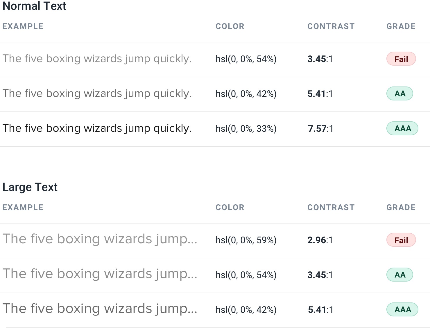
For typical dark-text-on-a-light-background situations, meeting this recommendation is pretty easy, but it gets a lot trickier when you start working with color.
Flipping the contrast
When using white text on a colored background, you’d be surprised how dark the color often needs to be to meet that 4.5:1 contrast ratio.

This can create hierarchy issues when those elements aren’t supposed to be the focus of the page — dark colored backgrounds will really grab the user’s attention.

You can solve this problem by flipping the contrast. Instead of using light text on a dark colored background, use dark colored text on a light colored background:

The color is still there to help support the text, but it’s way less in-your-face and doesn’t interfere as much with other actions on the page.
Rotating the hue
Even harder than white text on a colored background is colored text on a colored background. You’ll run into this situation if you’re ever trying to pick a color for some secondary text inside a dark-colored panel.
If you start by taking the background color and simply adjusting the lightness and saturation, you’ll find that it’s hard to meet the recommended contrast ratio without getting very close to pure white.
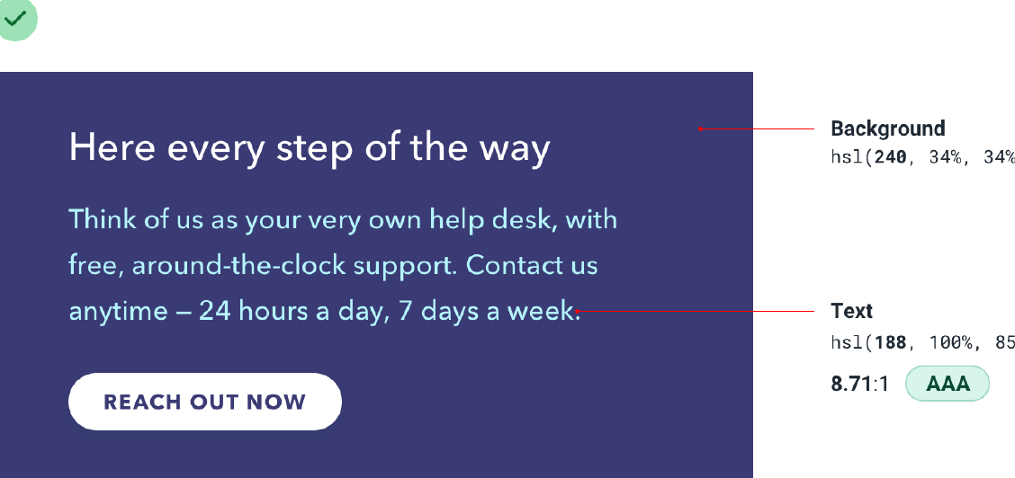
You don’t want the primary text and the secondary text to look the same, so what else can you do?
Well since some colors are brighter than others, one way to increase the contrast without getting closer to white is to rotate the hue towards a brighter color, like cyan, magenta, or yellow.
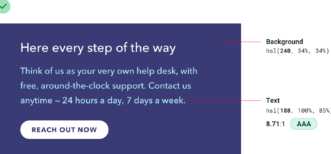
This can make it a lot easier to make the text accessible while still keeping it colorful.
Don’t rely on color alone
Color can be a fantastic way to enhance information and make it easier to understand, but be careful not to rely on it, or users with color blindness will have a hard time interpreting your UI.
Take these metric cards for example. With this design, someone who is red- green colorblind can’t easily tell if a metric has gotten better or worse:
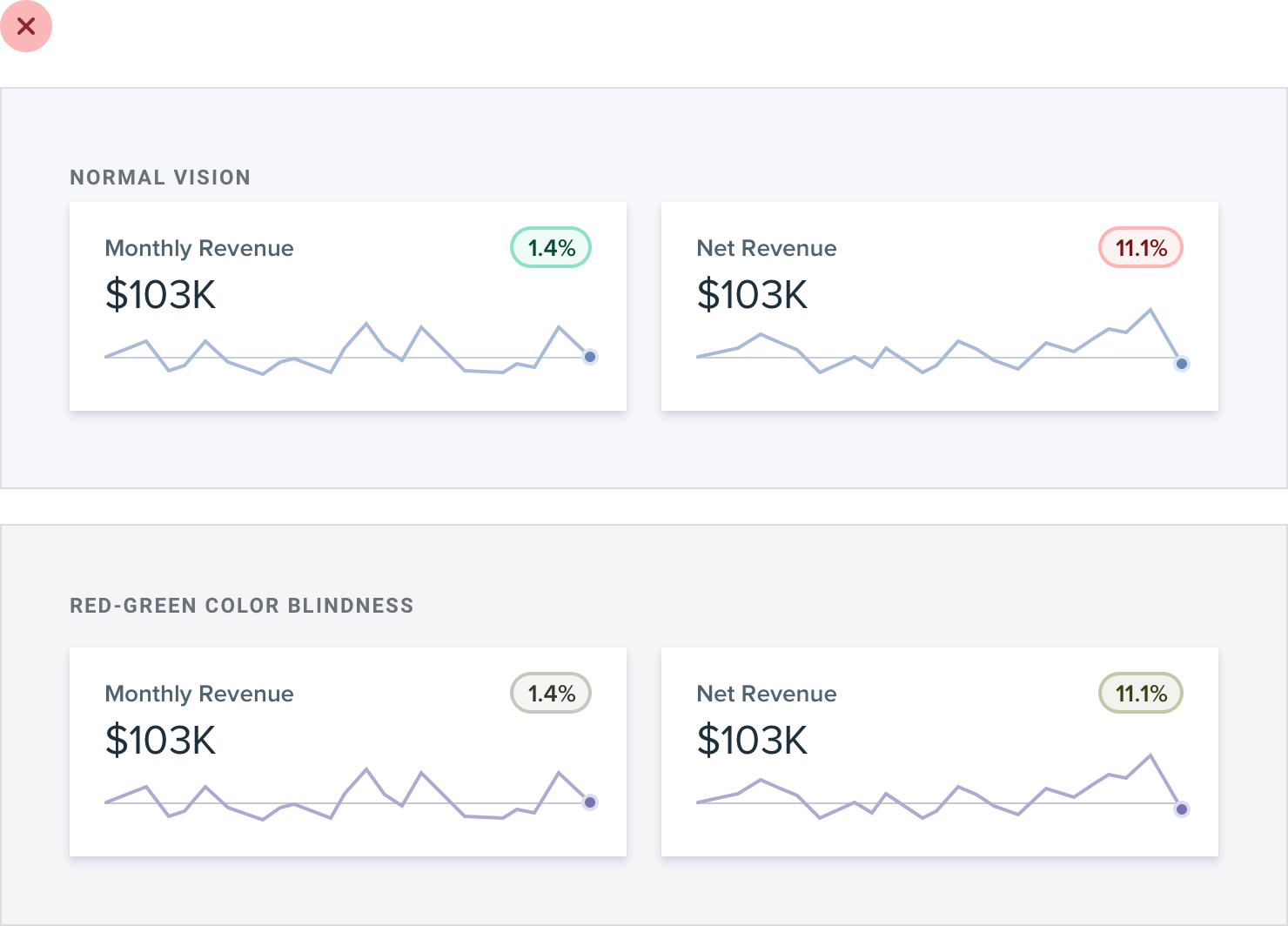
An easy fix for this is to also communicate that information in some other way, like by adding icons to indicate if the change is positive or negative.

What about something like a graph, where each trend line has a different color?
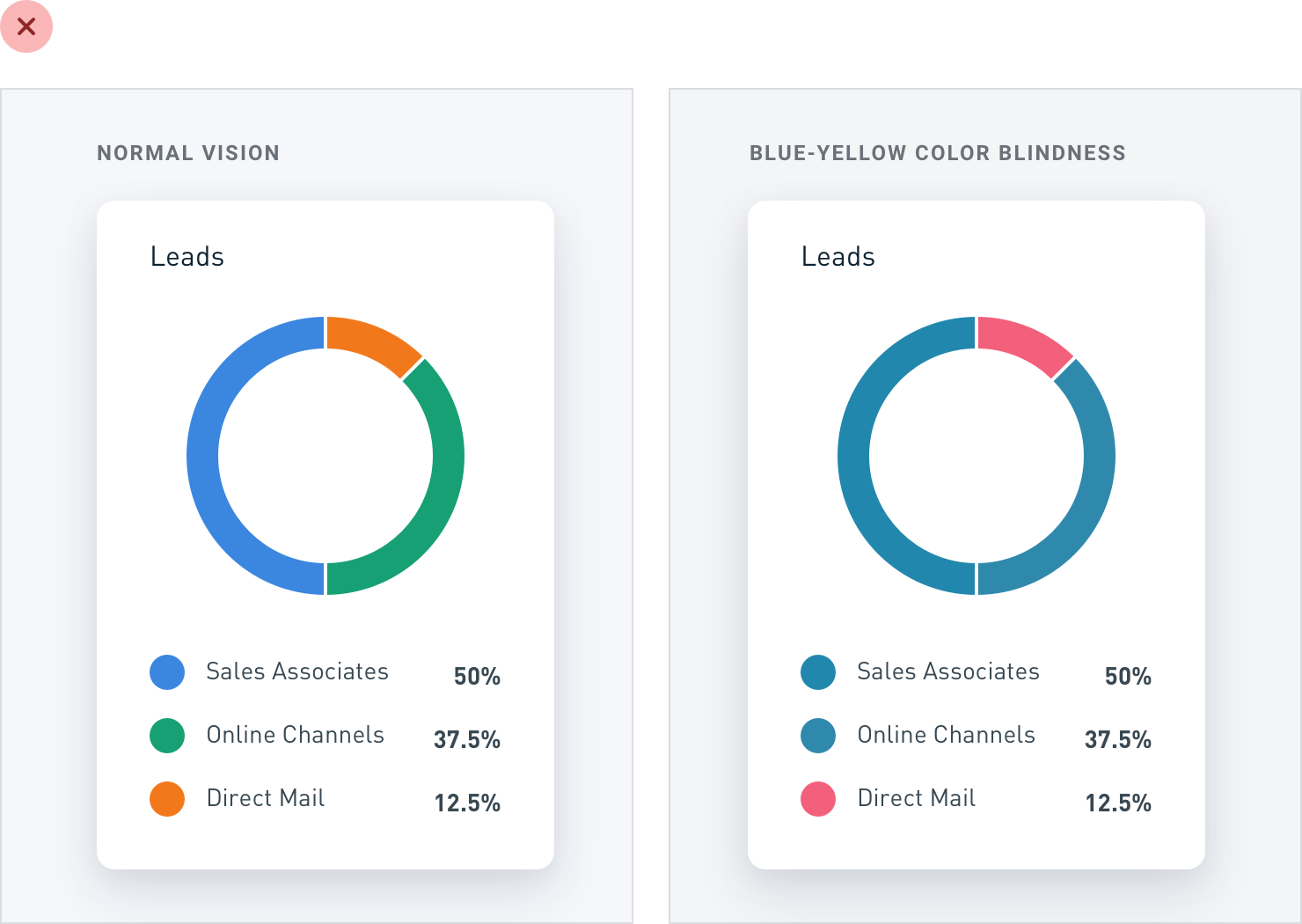
In situations like this, try relying on contrast instead of using completely different colors. It’s much easier for someone who’s colorblind to tell the
difference between light and dark than it is for them to tell the difference between two distinct colors.
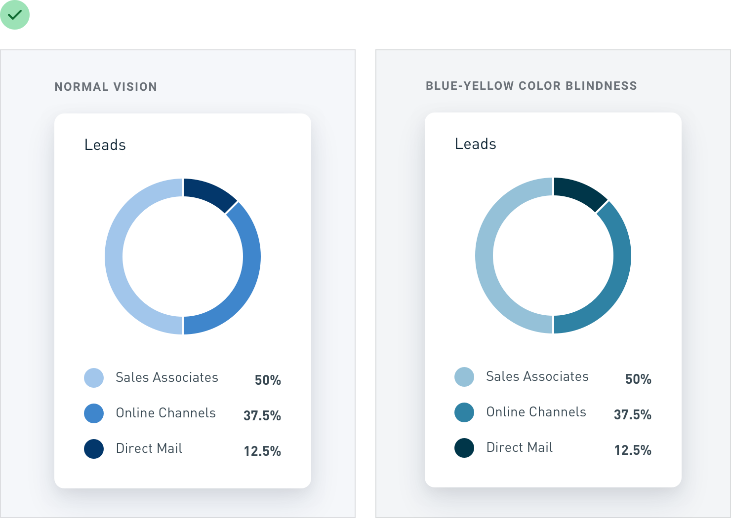
Always use color to support something that your design is already saying; never use it as the only means of communication.